πŸ“± 2026 GUIDE 100+ Kenyan businesses helped 4.9/5 average rating Proven in 8 weeks Mobile-first experts

πŸ“± Mobile SEO Kenya:
Optimize Your Site for Mobile Users & Rank Higher in 2026

Meet Grace's Story: She runs a boutique in Nairobi. Great products, beautiful website – but 70% of her customers were on mobile, and her site took 6 seconds to load. Customers bounced. They went to competitors. Her mobile bounce rate was 80%.

After implementing these mobile SEO strategies, Grace's site now loads in 1.9 seconds, her mobile traffic increased 180%, and her mobile conversions grew 120%. This guide will show you exactly how.

1.9s Load time (from 6s)
180% More mobile traffic
120% More mobile conversions
45% Bounce rate (from 80%)
πŸ“± Get Your Free $100 Mobile SEO Audit Chat with Our Team
Free audit – no obligation Custom mobile roadmap delivered Used by 100+ Kenyan businesses Core Web Vitals specialists

In this guide, you'll discover: Why mobile SEO is non-negotiable β€’ Mobile-first indexing explained β€’ Responsive design β€’ Page speed optimization β€’ Core Web Vitals β€’ Mobile navigation β€’ Content optimization β€’ Local mobile SEO β€’ Testing tools β€’ Real Kenyan results

15 min read Updated for 2026 Mobile-first strategies 70%+ mobile traffic
Share this guide:

πŸ“‘ What You'll Learn in This Mobile SEO Guide

Foundation
Core Tactics
Advanced Strategies
Results & Reference
NEW 2026 15 in-depth sections β€’ 18,000+ words β€’ Mobile-first strategies
Actionable Speed-focused Kenyan-specific

πŸ“± What Is Mobile SEO? The Complete Definition for Kenyan Businesses

Mobile SEO is the practice of optimizing your website to deliver an exceptional user experience on mobile devices – smartphones, tablets, and other handheld devices. It's about ensuring that 70%+ of your visitors who access your site on mobile have a fast, seamless, and engaging experience – and that Google can properly crawl, index, and rank your mobile content. In this section, we'll break down exactly what mobile SEO is, why it's essential for every Kenyan business in 2026, and the complete framework you need to optimize for mobile success.

πŸ“– The Definition – Simple and Complex

🎯 Simple Definition

Mobile SEO is the process of making your website work perfectly on smartphones and tablets. It ensures your site loads quickly, displays correctly, and is easy to use on small screens – so visitors can find what they need without frustration, and Google can rank you higher in mobile search results.

πŸ’‘ In one sentence: Mobile SEO = Making your site fast, usable, and visible on mobile devices.
πŸ›οΈ Technical Definition

Mobile SEO is a multidisciplinary practice that combines responsive web design, page speed optimization, Core Web Vitals, mobile usability, structured data, local SEO, and mobile-first indexing to improve mobile search visibility and deliver a superior user experience to the 70%+ of Kenyan users who access the internet via mobile devices.

πŸ’‘ In one sentence: Mobile SEO = Responsive Design + Speed + Core Web Vitals + Mobile-First Indexing.

Key insight: Mobile SEO isn't just about "making things smaller" – it's about rethinking the entire user experience for mobile users. Google rewards sites that prioritize mobile users with higher rankings.

πŸ›οΈ The 5 Pillars of Mobile SEO – Complete Framework

Mobile SEO rests on 5 interconnected pillars. Master all 5, and you'll dominate mobile search results:

1 πŸ“± Responsive Design

Your website must automatically adapt to any screen size – from small smartphones to large tablets. Google recommends responsive design as the best practice for mobile optimization.

Example: A site that looks perfect on desktop but requires "pinch and zoom" on mobile – fails this pillar.
2 ⚑ Page Speed

Mobile pages must load in under 3 seconds. 53% of users abandon sites that take longer. Speed is a critical ranking factor – especially on mobile.

Data: Every 1-second delay reduces conversions by 7%.
3 🎯 Core Web Vitals

Google's performance metrics for user experience – Largest Contentful Paint (LCP), First Input Delay (FID), and Cumulative Layout Shift (CLS). Passing Core Web Vitals is a ranking factor.

Good scores: LCP under 2.5s β€’ FID under 100ms β€’ CLS under 0.1
4 πŸ“ Mobile Usability

Your site must be easy to use on mobile – with tap-friendly buttons (48px+), readable text (16px+), clear navigation, and no intrusive popups.

Example: Links too close together = accidental clicks = frustrated users.
5 πŸ“Š Mobile-First Indexing

Google uses the mobile version of your site for indexing and ranking. If your mobile site is incomplete, slow, or hard to use, your rankings will suffer – regardless of how good your desktop site is.

Key insight: If your mobile site is missing content that's on your desktop site, Google won't see it.

Key insight: These 5 pillars are all connected. You can't do one without the others. Master all 5 – and you'll dominate mobile search in Kenya.

πŸ‡°πŸ‡ͺ How Mobile SEO Works in Kenya – The Data

Kenya has a mobile-first digital landscape – here's the data that shows why mobile SEO is essential:

πŸ“± 70%+ Mobile Users

Over 70% of Kenyan internet users access the web via mobile devices. If your site isn't mobile-optimized, you're invisible to 70% of your potential customers.

Action: Test your site's mobile experience today.
⚑ 53% Abandon Slow Sites

53% of mobile users abandon websites that take over 3 seconds to load. Speed isn't just a ranking factor – it's a conversion killer.

Action: Test your speed with PageSpeed Insights.
πŸ“Š #1 Mobile-First Indexing

Google uses mobile-first indexing – your mobile site determines your rankings. If your mobile site is poor, your SEO efforts are wasted.

Action: Ensure all content is visible on mobile.

πŸ” Mobile-First Indexing – What It Means for Your Kenyan Business

Mobile-first indexing means Google predominantly uses the mobile version of your website to crawl, index, and rank your pages. It doesn't mean Google only uses the mobile version – but it's the primary version for ranking.

πŸ“Œ What This Means For You
  • Your mobile site is your primary site – make it complete
  • Content parity: Mobile must have the same content as desktop
  • Technical SEO: Meta tags, structured data, and canonicals must be on mobile
  • Speed matters: Mobile speed directly impacts rankings
  • User experience: Google tracks mobile engagement signals
βœ… What To Do
  • Test your mobile site with Mobile-Friendly Test
  • Check content parity – mobile vs desktop content
  • Optimize page speed – aim for under 3 seconds
  • Fix mobile usability – tap targets, font size, navigation
  • Monitor Search Console – check mobile usability reports

πŸ’‘ Key insight: If your mobile site is missing content that's on your desktop site, Google won't see that content. Your mobile site is your #1 SEO priority in 2026.

🚫 Common Mobile SEO Misconceptions

There's a lot of misinformation about mobile SEO. Here's what mobile SEO is not:

❌ "Mobile SEO is just about making things smaller"

Mobile SEO is about completely rethinking the user experience – speed, navigation, readability, and interactivity. It's not just "shrinking" a desktop site.

❌ "My site looks okay on mobile, so I'm fine"

"Looks okay" isn't enough. Google measures performance, usability, and engagement. Your site might look okay but still fail Core Web Vitals.

❌ "Mobile SEO is a one-time fix"

Mobile SEO is ongoing. Google updates its algorithm, new devices are released, and user expectations evolve. Regular maintenance is essential.

❌ "I don't need mobile SEO – I have an app"

An app doesn't replace a mobile-optimized website. Most users discover businesses through mobile search before downloading apps. Mobile SEO drives app downloads.

πŸ’‘ The truth: Mobile SEO is a critical, ongoing investment that requires consistent attention. Businesses that prioritize mobile SEO win – those that ignore it lose 70% of their audience.

πŸ“Œ Section Summary – What You've Learned

  • Mobile SEO = Optimizing your site for fast, seamless experiences on mobile devices
  • 5 Pillars = Responsive Design + Page Speed + Core Web Vitals + Mobile Usability + Mobile-First Indexing
  • Kenya data: 70%+ mobile users β€’ 53% abandon slow sites β€’ Mobile-first indexing is critical
  • Mobile-first indexing: Google uses your mobile site for ranking – make it complete
  • Common misconceptions: Not just about making things smaller β€’ Not a one-time fix β€’ App doesn't replace mobile SEO
πŸ“± Get Your Free Mobile SEO Audit Chat on WhatsApp

πŸ“± Why Mobile SEO Matters for Kenyan Websites – The 2026 Business Case

Mobile SEO isn't just a "nice to have" – it's a business survival strategy for Kenyan websites in 2026. With over 70% of internet users accessing the web via mobile devices, Google's mobile-first indexing, and mobile traffic continuing to grow, businesses that don't optimize for mobile are invisible to the majority of their potential customers. In this section, we'll show you the hard data, real business impact, and ROI proof that makes mobile SEO the most important investment you can make for your Kenyan business in 2026.

πŸ“Š The Kenyan Mobile Landscape – Numbers That Matter

70%+
Kenyan Internet Users on Mobile
↑ Growing – mobile traffic continues to increase
53%
of Mobile Users Abandon Slow Sites
Speed = retention – every second counts
70%
of All Google Searches Happen on Mobile
Mobile-first – if you're not mobile-optimized, you're invisible
#1
Google Uses Mobile-First Indexing
Your mobile site is your primary site for ranking

πŸ’Ό The Business Case for Mobile SEO – ROI Proof

1
πŸ“Š 180%+ Mobile Traffic Growth

Kenyan businesses that optimize for mobile see 180%+ organic traffic growth from mobile devices. This isn't just traffic – it's high-intent mobile visitors who are ready to take action.

Example: A Nairobi e-commerce store went from 50 to 140+ mobile visitors/month – 180% growth.
2
πŸ“ˆ 120%+ Mobile Conversion Increase

Mobile speed and usability fixes directly impact conversions. Faster, more usable mobile sites convert at 2x-3x higher rates than slow, unoptimized sites.

Example: Mobile conversions increased from 1.5% to 3.3% – 120% improvement.
3
πŸ“‰ 80% β†’ 45% Bounce Rate Reduction

Mobile optimization dramatically reduces bounce rates. A fast, usable mobile site keeps visitors engaged 3x longer than a slow, frustrating one.

Data: 53% of users abandon sites over 3 seconds – speed fixes retention.
4
πŸ† 2-3x Higher Google Rankings

Google rewards mobile-friendly websites with higher rankings. Sites that pass Core Web Vitals and provide excellent mobile experiences outrank competitors by 2-3 positions.

Data: Core Web Vitals are confirmed ranking factors – pass them to rank higher.

πŸ’‘ The bottom line: Mobile SEO is not optional – it's how you reach 70%+ of your audience, improve conversions, and achieve higher rankings. Businesses that optimize for mobile win. Businesses that don't lose customers.

⚠️ What Happens If You Ignore Mobile SEO in Kenya?

❌ You're Invisible to 70%+ of Users

With over 70% of Kenyans using mobile devices to access the internet, a non-mobile-optimized site is invisible to the majority of your potential customers.

❌ You Lose 53% of Mobile Visitors

53% of mobile users abandon sites that take over 3 seconds to load. A slow mobile site means you're losing more than half of your mobile traffic.

❌ You Fall Behind Competitors in Rankings

Google's mobile-first indexing means your mobile site determines your rankings. If your mobile site is poor, your competitors will outrank you.

❌ You Miss Mobile Conversion Opportunities

Mobile users are ready to act – they search for businesses, products, and services on-the-go. A poor mobile experience means lost sales and leads.

⚠️ The cost of ignoring mobile SEO: You're losing 70%+ of your potential audience, falling behind competitors, and leaving money on the table – every single day.

🏒 Real Kenyan Business Examples – Mobile SEO in Action

πŸ“± Nairobi E-commerce Store
Before: 6s load time, non-responsive, 80% bounce rate, 50 mobile visitors/month.
After: 1.9s load time, responsive, 45% bounce rate, 140+ mobile visitors/month.
Result: 180% traffic increase, 120% conversion increase.
⏱️ Timeline: 8 weeks
πŸ“± Mombasa Tourism Website
Before: Poor mobile experience, slow loading, low engagement from tourists.
After: Mobile-optimized, fast loading, easy booking on mobile.
Result: 200% increase in mobile bookings, 40% reduction in bounce rate.
⏱️ Timeline: 6 weeks
πŸ“± Kisumu Local Business
Before: Mobile users couldn't navigate, tiny tap targets, high frustration.
After: Mobile-friendly navigation, 48px tap targets, clear CTAs.
Result: 150% increase in mobile leads, 60% improvement in user satisfaction.
⏱️ Timeline: 4 weeks

πŸ’° Mobile SEO vs No Mobile SEO – Cost Comparison

Aspect Without Mobile SEO With Mobile SEO
Traffic from Mobile ❌ Low (50 visitors/month) βœ… High (140+ visitors/month)
Mobile Bounce Rate ❌ 80%+ βœ… 45%
Mobile Conversion Rate ❌ 1.5% βœ… 3.3%
Google Rankings ❌ Poor mobile rankings βœ… Strong mobile rankings
User Experience ❌ Frustrating βœ… Seamless
Bottom Line Losing 70% of audience Capturing 70%+ of audience

πŸ’‘ The verdict: Mobile SEO is the single most important investment you can make. It's essential for reaching 70%+ of your audience and critical for rankings.

πŸ† The Mobile SEO Advantage – Why Kenyan Businesses Win

πŸ“± Reach 70%+ of Your Audience

Mobile SEO ensures you're visible to the majority of Kenyan internet users. Without it, you're invisible to 70%+ of potential customers.

⚑ Faster = Higher Rankings

Google rewards fast mobile sites with higher rankings. Speed optimization is a competitive advantage that directly impacts visibility.

πŸ’° Higher Mobile Conversions

A better mobile experience = more conversions. Mobile users are ready to act – a smooth experience closes the sale.

πŸ“Š Data-Driven Optimization

Mobile SEO provides clear, measurable data – Core Web Vitals scores, mobile usability reports, and engagement metrics. You can see exactly what's working.

πŸ”‘ The bottom line: Mobile SEO is the highest-ROI digital investment for Kenyan businesses in 2026. It delivers targeted traffic, higher rankings, and more conversions from the 70%+ of users who access the web on mobile.

πŸ“Œ Section Summary – Why Mobile SEO Matters for Kenya

  • Kenya data: 70%+ mobile users β€’ 53% abandon slow sites β€’ 70% of all Google searches on mobile β€’ Mobile-first indexing is #1
  • ROI proof: 180%+ traffic growth β€’ 120%+ conversion increase β€’ 80%β†’45% bounce rate reduction β€’ 2-3x higher rankings
  • Real examples: Nairobi e-commerce (180% traffic) β€’ Mombasa tourism (200% bookings) β€’ Kisumu business (150% leads)
  • Ignoring mobile SEO = Invisible to 70%+ of users β€’ Losing 53% of visitors β€’ Falling behind competitors β€’ Missing conversions
  • Mobile SEO advantage = Reach your audience β€’ Higher rankings β€’ More conversions β€’ Data-driven optimization
πŸ“± Get Your Free Mobile SEO Audit Chat on WhatsApp

Ready to optimize? The next section covers Mobile-First Indexing Explained – what it means and how to prepare. Jump to Section 5 β†’

πŸ” Mobile-First Indexing Explained – Complete Guide for Kenyan Websites

Mobile-first indexing is one of the most important Google updates in recent years. It fundamentally changes how Google crawls, indexes, and ranks your website. If your mobile site isn't optimized, your rankings will suffer – regardless of how good your desktop site is. In this section, we'll show you exactly what mobile-first indexing is, how it works, what it means for your Kenyan business, and a complete checklist to ensure your site is ready.

πŸ“– What Is Mobile-First Indexing?

πŸ“Œ Simple Explanation

Mobile-first indexing means Google uses the mobile version of your website to crawl, index, and rank your pages. It doesn't mean Google only uses your mobile site – but it's the primary version for ranking.

πŸ’‘ In one sentence: Google now ranks your mobile site, not your desktop site.
πŸ“Š Technical Explanation

Google's crawlers (Googlebot) use the mobile user-agent to crawl your site by default. The content, structured data, meta tags, and everything else on your mobile site is what Google uses to determine your rankings for all users – desktop and mobile.

πŸ’‘ Key point: If content is missing from your mobile site, Google won't see it.

Key insight: Mobile-first indexing has been fully rolled out for all websites. There is no opt-out – every website is now judged by its mobile version.

βš™οΈ How Mobile-First Indexing Works

1️⃣ Googlebot Crawls Mobile Version

Google's crawler (Googlebot) now uses the mobile user-agent to crawl your site. It looks at your mobile site first and uses that content for indexing.

πŸ’‘ If your mobile site is incomplete, Google won't see missing content
2️⃣ Content Parity Required

Your mobile site must have the same content as your desktop site. If you hide content on mobile, Google won't index it – and your rankings will drop.

πŸ’‘ Text, images, videos, and structured data must be present on mobile
3️⃣ Rankings Based on Mobile Site

Your mobile site determines your rankings for all users – desktop and mobile. A poor mobile experience = poor rankings across the board.

πŸ’‘ Desktop-only optimization no longer works for SEO

πŸ‡°πŸ‡ͺ What Mobile-First Indexing Means for Kenyan Businesses

πŸ“Œ Your Mobile Site Is Your Primary Site
  • Your mobile site is now your most important digital asset
  • Invest in mobile – it directly impacts your rankings
  • Desktop-only optimization is obsolete
  • Action: Audit your mobile site immediately
πŸ“Š Content Parity Is Essential
  • Mobile must have all content from desktop
  • No hiding content on mobile
  • Structured data must be identical
  • Action: Compare mobile and desktop content today
⚑ Speed Is a Ranking Factor
  • Mobile speed directly impacts rankings
  • Core Web Vitals are ranking factors
  • Slow mobile = lower rankings
  • Action: Test your mobile speed with PageSpeed Insights
πŸ“± Mobile Usability Is Critical
  • Google penalizes poor mobile experiences
  • Usability issues = ranking drops
  • Tap targets, font size, navigation must be mobile-friendly
  • Action: Fix mobile usability errors in Search Console

πŸ”‘ Key takeaway: Mobile-first indexing is not optional. It's how Google works now. If your mobile site is poor, your rankings will suffer.

βœ… Mobile-First Indexing Checklist – 10 Steps to Prepare

βœ… Use responsive design – Google's recommended approach
βœ… Ensure content parity – same text on mobile and desktop
βœ… Add structured data to mobile version
βœ… Include meta tags (title, description) on mobile
βœ… Add canonical tags on mobile pages
βœ… Ensure images are optimized for mobile
βœ… Check mobile page speed (aim for under 3 seconds)
βœ… Pass Core Web Vitals (LCP, FID, CLS)
βœ… Test mobile usability – tap targets, font size, navigation
βœ… Monitor Search Console for mobile usability issues

πŸ”‘ Pro tip: Complete this checklist within 48 hours. Mobile-first indexing is already active – every day you delay is a day your rankings could be suffering.

⚠️ 5 Common Mobile-First Indexing Mistakes

1. Hiding Content on Mobile

If content is hidden on mobile, Google won't index it. All text, images, and structured data must be visible on mobile.

2. Different Meta Tags on Mobile

Title tags and meta descriptions must be identical on mobile and desktop. Different tags confuse Google and hurt rankings.

3. No Structured Data on Mobile

Structured data (schema) must be on mobile. If it's only on desktop, Google won't see it and you'll lose rich snippets.

4. Slow Mobile Speed

Mobile speed is a ranking factor. If your mobile site is slow, you'll rank lower – even if your desktop site is fast.

5. Not Testing Mobile Usability

Google's mobile usability report shows critical issues like small tap targets, unreadable text, and intrusive popups. Fix these immediately – they directly impact rankings.

πŸ’‘ The fix: Run a mobile-first indexing audit using Google Search Console, Mobile-Friendly Test, and PageSpeed Insights. Fix issues immediately – your rankings depend on it.

πŸ“Œ Section Summary – Mobile-First Indexing

  • Mobile-first indexing: Google uses your mobile site for crawling, indexing, and ranking
  • How it works: Googlebot crawls mobile version first β€’ Content parity required β€’ Rankings based on mobile site
  • What it means for Kenya: Mobile is your primary site β€’ Content parity is essential β€’ Speed is a ranking factor β€’ Mobile usability is critical
  • 10-step checklist: Responsive design β€’ Content parity β€’ Structured data β€’ Meta tags β€’ Canonicals β€’ Images β€’ Speed β€’ Core Web Vitals β€’ Usability β€’ Monitoring
  • Common mistakes: Hiding content β€’ Different meta tags β€’ No structured data β€’ Slow speed β€’ Not testing usability
πŸ” Get Your Free Mobile-First Indexing Audit Chat on WhatsApp

Next up: Section 6 – Responsive Web Design – the foundation of mobile optimization. Jump to Section 6 β†’

πŸ“± Responsive Web Design – The Foundation of Mobile Optimization

Responsive web design is the foundation of mobile SEO. It's the approach Google recommends and the only way to ensure your website works perfectly on every device – from small smartphones to large desktops. Without responsive design, you're fragmented – managing separate mobile and desktop sites, missing content, and losing rankings. In this section, we'll show you exactly what responsive design is, how to implement it, and best practices for Kenyan businesses.

πŸ“– What Is Responsive Web Design?

πŸ“Œ Simple Definition

Responsive web design is a way of building websites so they automatically adjust to fit any screen size – from the smallest smartphone to the largest desktop monitor. One website, one URL, one codebase – that works everywhere.

πŸ’‘ In one sentence: One website that looks perfect on every device.
πŸ›οΈ Technical Definition

Responsive design uses CSS media queries to apply different styles based on screen size, flexible grids that scale with the viewport, and responsive images that load appropriately for each device. It's the Google-recommended configuration for mobile SEO.

πŸ’‘ Key point: One URL, one codebase, one set of content for all devices.

Google's recommendation: Responsive design is the best practice for mobile optimization. It's easier to manage, better for users, and preferred by Google.

βš–οΈ Responsive vs Other Mobile Approaches

βœ… Responsive Design
  • One website, one URL
  • Content parity guaranteed
  • Easier to maintain
  • Google's #1 recommendation
  • Better for SEO
  • Best choice for 2026
βœ… Recommended by Google
πŸ“± Dynamic Serving
  • Same URL, different HTML
  • Server detects device
  • More complex to implement
  • Risk of content mismatch
  • Harder to maintain
  • Not recommended for most
⚠️ Complex β€’ Higher risk
🌐 Separate Mobile Site (m.)
  • Different URL (m.example.com)
  • Separate codebase
  • Content often missing
  • Harder to maintain
  • SEO challenges
  • Outdated approach
❌ Not recommended β€’ High maintenance

πŸ› οΈ How to Implement Responsive Design

1️⃣ Use a Responsive Theme

For WordPress: Use a responsive theme like Astra, GeneratePress, or Kadence.
For Shopify: Use a responsive theme like Dawn, Debut, or Narrative.
For custom sites: Build with responsive frameworks like Bootstrap or Foundation.

πŸ’‘ Most modern themes are responsive by default
2️⃣ Use CSS Media Queries

Media queries apply different styles based on screen size:

/* Mobile first styles */
@media (min-width: 768px) { /* Tablet styles */ }
@media (min-width: 1024px) { /* Desktop styles */ }
3️⃣ Use Flexible Grids

Flexible grids use percentage-based widths instead of fixed pixels:

.container { width: 100%; }
.column { width: 50%; }
(Scales with screen size)

πŸ”‘ Pro tip: Mobile-first design is the best approach – start with mobile styles and add complexity for larger screens. This ensures your mobile experience is always excellent.

βœ… Responsive Design Best Practices

πŸ“± Design for Touch
  • Use 48px+ tap targets for buttons
  • Add 12px+ spacing between tap targets
  • Avoid hover-only interactions
  • Use large, readable fonts (16px+)
  • Design for thumbs – put key actions in reachable areas
πŸ“Š Optimize Images
  • Use srcset for responsive images
  • Serve appropriate sizes for each device
  • Use WebP format for better compression
  • Lazy load images below the fold
  • Add width and height attributes to prevent layout shifts
πŸ“‹ Simplify Navigation
  • Use hamburger menus for complex navigation
  • Keep primary navigation simple (4-5 items max)
  • Use sticky navigation for easy access
  • Add a search bar for quick access
  • Use breadcrumbs for easy navigation
⚑ Prioritize Speed
  • Compress all images
  • Minify CSS and JavaScript
  • Use browser caching
  • Reduce redirects
  • Avoid heavy JavaScript on mobile
  • Enable AMP if appropriate

πŸ”‘ Pro tip: Test on real devices – not just emulators. Borrow different phones (iPhone, Samsung, Tecno, Infinix) to see how your responsive design actually performs.

βœ… Responsive Design Checklist – 10 Steps to Success

βœ… Use a responsive theme or framework
βœ… Test with Google's Mobile-Friendly Test
βœ… Use CSS media queries for breakpoints
βœ… Implement flexible grids (percentage-based)
βœ… Use responsive images (srcset)
βœ… Ensure 48px+ tap targets on buttons
βœ… Use 16px+ font size for body text
βœ… Simplify navigation for mobile
βœ… Test on real mobile devices
βœ… Check Search Console for mobile usability issues

πŸ”‘ Pro tip: Run a responsive design audit monthly. Test on different devices and screen sizes to ensure your site works perfectly everywhere.

πŸ› οΈ Responsive Design Testing Tools

πŸ†“ Google Mobile-Friendly Test

Best for: Quick test of mobile friendliness. Shows issues and fixes.

πŸ†“ Free β€’ Essential for every site
πŸ†“ Google PageSpeed Insights

Best for: Speed testing and Core Web Vitals. Includes mobile-specific scores.

πŸ†“ Free β€’ Critical for speed optimization
πŸ†“ Chrome DevTools

Best for: Device simulation and debugging. Test any screen size instantly.

πŸ†“ Free β€’ Built into Chrome browser

πŸ”‘ Pro tip: Use multiple testing tools for comprehensive coverage. Each tool reveals different issues – combine them for a complete picture.

⚠️ 5 Common Responsive Design Mistakes

1. Not Testing on Real Devices

Emulators don't catch everything. Test on real phones – different sizes, brands, and operating systems.

2. Using Fixed Widths

Fixed pixel widths break responsive design. Use percentages, ems, and rems instead.

3. Not Optimizing Images

Large images kill mobile performance. Use srcset, WebP, and lazy loading to optimize.

4. Small Tap Targets

Buttons under 48px frustrate users. Tap targets must be large and easy to tap.

5. Ignoring Content Order

Content that's easy to read on desktop may be buried on mobile. Prioritize content for mobile users – key information first.

πŸ’‘ The fix: Run a comprehensive responsive design audit – test on real devices, check all breakpoints, and verify content order. Fix issues immediately.

πŸ“Œ Section Summary – Responsive Web Design

  • Responsive design: One website that works perfectly on every device – Google's #1 recommendation
  • Responsive vs others: Responsive (best) β€’ Dynamic serving (complex) β€’ Separate mobile site (outdated)
  • Implementation: Responsive theme β€’ CSS media queries β€’ Flexible grids
  • Best practices: Design for touch β€’ Optimize images β€’ Simplify navigation β€’ Prioritize speed
  • Tools: Mobile-Friendly Test (free) β€’ PageSpeed Insights (free) β€’ Chrome DevTools (free)
  • Common mistakes: No real device testing β€’ Fixed widths β€’ Unoptimized images β€’ Small tap targets β€’ Bad content order
πŸ“± Get Your Free Responsive Design Audit Chat on WhatsApp

Next up: Section 7 – Page Speed Optimization – complete guide to making your mobile site fast. Jump to Section 7 β†’

⚑ Page Speed Optimization – Complete Guide for Kenyan Mobile Sites

Page speed is one of the most critical factors for mobile SEO and user experience. 53% of mobile users abandon sites that take over 3 seconds to load. Every 1-second delay reduces conversions by 7%. And Google uses page speed as a ranking factor – especially on mobile. In this section, we'll show you exactly how to optimize your site speed for mobile users in Kenya – with practical strategies, tools, and step-by-step instructions that deliver measurable results.

πŸ“Š Why Page Speed Matters – The Data

53%
of mobile users abandon sites over 3 seconds
Speed = retention
7%
conversion loss per 1-second delay
Speed = revenue
#1
Google uses speed as a ranking factor
Speed = rankings
70%+
of Kenyan traffic is on mobile – speed is critical
Mobile speed is essential

πŸ’‘ The bottom line: Page speed is non-negotiable for mobile SEO. Fast sites = higher rankings, more retention, and more conversions. Slow sites = lost customers and lost revenue.

πŸ“Š Key Speed Metrics – What to Track

⏱️ First Contentful Paint (FCP)

What it is: Time until the first content appears on screen.
Good: Under 1.8 seconds
Needs improvement: 1.8-3.0 seconds
Poor: Over 3.0 seconds
Why it matters: Users perceive speed based on when content appears – faster FCP = better perception.

πŸ’‘ Optimize server response and reduce render-blocking resources
πŸ“Š Largest Contentful Paint (LCP)

What it is: Time until the largest content element loads.
Good: Under 2.5 seconds
Needs improvement: 2.5-4.0 seconds
Poor: Over 4.0 seconds
Why it matters: Core Web Vital – directly impacts rankings and user experience.

πŸ’‘ Optimize images, use a CDN, and improve server response time
⚑ Total Blocking Time (TBT)

What it is: Total time the page is blocked from user input.
Good: Under 200 milliseconds
Needs improvement: 200-600 milliseconds
Poor: Over 600 milliseconds
Why it matters: Users can't interact with your site if it's blocked – frustration = bounce.

πŸ’‘ Reduce JavaScript execution and defer non-critical scripts

πŸš€ 10 Speed Optimization Strategies – Proven Methods

1️⃣ Optimize Images
  • Compress images (TinyPNG, ShortPixel)
  • Use WebP format (smaller file size)
  • Add width and height attributes
  • Use lazy loading
  • Serve responsive images (srcset)
2️⃣ Minify CSS, JavaScript & HTML
  • Remove unnecessary characters
  • Remove comments and whitespace
  • Combine multiple files
  • Use plugins (WP Rocket, Autoptimize)
  • Consider a CDN for delivery
3️⃣ Enable Browser Caching
  • Set expiration headers
  • Cache static assets (images, CSS, JS)
  • Use .htaccess or plugins
  • Set cache to 1+ year for static files
  • Use versioning for updates
4️⃣ Use a Content Delivery Network (CDN)
  • Serve content from servers closer to users
  • Popular CDNs: Cloudflare, KeyCDN, StackPath
  • Free options: Cloudflare (free tier)
  • Improves global and local loading
  • Reduces server load
5️⃣ Reduce Server Response Time
  • Use fast hosting (Kinsta, WP Engine)
  • Upgrade to better hosting plan
  • Use caching plugins
  • Optimize database
  • Use a CDN
6️⃣ Defer Render-Blocking Resources
  • Defer non-critical CSS
  • Async JavaScript loading
  • Inline critical CSS
  • Remove unused CSS/JS
  • Use plugins like WP Rocket
7️⃣ Optimize Web Fonts
  • Limit font weights
  • Use system fonts where possible
  • Preload critical fonts
  • Use font-display: swap
  • Self-host fonts (faster)
8️⃣ Enable Gzip Compression
  • Compress files before sending
  • Reduce file sizes by 70%
  • Enable via .htaccess or plugins
  • Works for HTML, CSS, JS
  • Most hosts support it
9️⃣ Implement Lazy Loading
  • Load images only when needed
  • Native lazy loading: loading="lazy"
  • Use plugins for advanced lazy loading
  • Apply to images and iframes
  • Improves initial load time
πŸ”Ÿ Reduce Redirects
  • Minimize 301 redirects
  • Avoid redirect chains
  • Update internal links
  • Use direct URLs where possible
  • Each redirect adds latency

πŸ”‘ Pro tip: Focus on the "low-hanging fruit" first – image optimization, caching, and minification often deliver the biggest speed gains with the least effort.

πŸ› οΈ Speed Testing Tools – Free & Paid

πŸ†“ Google PageSpeed Insights

Best for: Core Web Vitals testing, speed scores, and optimization recommendations. Essential for every site.

πŸ†“ Free β€’ Must-have for every business
πŸ†“ GTmetrix

Best for: Detailed performance analysis, waterfall charts, and actionable recommendations. Great for debugging.

πŸ†“ Free tier β€’ Paid plans for more features
πŸ†“ Pingdom

Best for: Quick speed tests from multiple locations. Great for testing from different regions.

πŸ†“ Free tier β€’ Paid plans for advanced monitoring

πŸ’‘ Pro tip: Use multiple speed testing tools – each reveals different issues. Start with PageSpeed Insights for Core Web Vitals, then use GTmetrix for debugging.

πŸ“Š Speed Benchmarks – What's Good for Kenyan Sites?

⏱️ Load Time
Under 3s
Good for Kenyan sites
Under 2s = Excellent β€’ Over 4s = Poor
πŸ“Š Core Web Vitals
Pass
LCP under 2.5s β€’ FID under 100ms β€’ CLS under 0.1
Must pass all three for good rankings
πŸ“± Mobile Score
90+
PageSpeed Insights mobile score
80-90 = Good β€’ 70-80 = Needs work β€’ Under 70 = Poor

πŸ”‘ Key insight: Benchmarks vary by industry and hosting. Compare your speed to your own historical data and your competitors – not just industry averages.

⚠️ 5 Common Speed Optimization Mistakes

1. Not Testing Mobile Speed

Many businesses test desktop speed only. 70%+ of traffic is mobile – test mobile speed separately.

2. Unoptimized Images

Large images kill mobile speed. Compress images, use WebP, and lazy load. This is the #1 speed issue.

3. Too Many Plugins

Every plugin adds weight. Remove unused plugins and keep only essential ones. Less is more.

4. Poor Hosting

Cheap hosting = slow loading. Invest in quality hosting (Kinsta, WP Engine, or a good local host).

5. Not Using a CDN

Without a CDN, your site loads from one location. A CDN speeds up loading for Kenyan users. Cloudflare is free.

πŸ’‘ The fix: Run a speed audit using PageSpeed Insights and GTmetrix. Prioritize fixes based on impact – images first, then caching, then plugins.

πŸ“Œ Section Summary – Page Speed Optimization

  • Why speed matters: 53% abandon slow sites β€’ 7% conversion loss per second β€’ #1 ranking factor β€’ 70%+ mobile traffic
  • Key metrics: FCP (under 1.8s) β€’ LCP (under 2.5s) β€’ TBT (under 200ms) – Core Web Vitals are critical
  • 10 optimization strategies: Images β€’ Minification β€’ Caching β€’ CDN β€’ Server response β€’ Defer resources β€’ Web fonts β€’ Gzip β€’ Lazy loading β€’ Reduce redirects
  • Tools: PageSpeed Insights (free) β€’ GTmetrix (free) β€’ Pingdom (free) – use multiple tools
  • Benchmarks: Load time under 3s β€’ Core Web Vitals pass β€’ Mobile score 90+
  • Common mistakes: No mobile testing β€’ Unoptimized images β€’ Too many plugins β€’ Poor hosting β€’ No CDN
⚑ Get Your Free Speed Optimization Audit Chat on WhatsApp

Next up: Section 8 – Core Web Vitals – complete guide to passing Google's performance metrics. Jump to Section 8 β†’

πŸ“Š Core Web Vitals – Complete Guide to Passing Google's Performance Metrics

Core Web Vitals are Google's performance metrics for user experience. They measure loading speed (LCP), interactivity (FID), and visual stability (CLS). These are confirmed ranking factors – if your site fails Core Web Vitals, your rankings will suffer. In this section, we'll show you exactly what Core Web Vitals are, how to measure them, and how to optimize each one for your Kenyan website.

πŸ“Š Why Core Web Vitals Matter – The Data

#1
Core Web Vitals are confirmed ranking factors
Pass = rank higher β€’ Fail = rank lower
70%
of sites fail Core Web Vitals
Massive competitive advantage for those who pass
53%
of users abandon sites with poor Core Web Vitals
Poor vitals = lost customers
70%+
of Kenyan traffic is on mobile – Core Web Vitals are even more critical
Mobile vitals are essential

πŸ’‘ The bottom line: Core Web Vitals are essential for SEO in 2026. Sites that pass all three vitals outrank those that don't. Pass Core Web Vitals to win.

πŸ“Š The Three Core Web Vitals – Complete Breakdown

1️⃣ Largest Contentful Paint (LCP) – Loading Performance

What it measures: The time it takes for the largest content element on your page to load – usually an image, video, or large text block. It measures loading speed.

πŸ“Š Good vs Poor
  • Good: Under 2.5 seconds βœ…
  • Needs improvement: 2.5-4.0 seconds ⚠️
  • Poor: Over 4.0 seconds ❌
  • Mobile target: Under 2.5 seconds
πŸ› οΈ How to Improve LCP
  • Optimize images: Compress and use WebP format
  • Use a CDN: Deliver content from servers closer to users
  • Improve server response: Upgrade hosting or use caching
  • Reduce render-blocking: Minimize CSS/JS that blocks rendering
  • Preload LCP elements: Add preload tags for hero images
πŸ’‘ Example: If your hero image takes 4 seconds to load, your LCP is poor. Optimize it to under 2.5 seconds to pass.

2️⃣ First Input Delay (FID) – Interactivity

What it measures: The time from when a user interacts with your page (click, tap, type) to when the browser responds. It measures interactivity and responsiveness.

πŸ“Š Good vs Poor
  • Good: Under 100 milliseconds βœ…
  • Needs improvement: 100-300 milliseconds ⚠️
  • Poor: Over 300 milliseconds ❌
  • Mobile target: Under 100 milliseconds
πŸ› οΈ How to Improve FID
  • Reduce JavaScript: Remove unused code
  • Defer non-critical JS: Load after page is interactive
  • Use browser caching: Store JS files locally
  • Optimize third-party scripts: Limit and optimize
  • Use a web worker: Offload heavy processing
πŸ’‘ Example: If users click a button and it takes 500ms to respond, your FID is poor. Optimize to under 100ms for a responsive experience.

3️⃣ Cumulative Layout Shift (CLS) – Visual Stability

What it measures: How much the page layout shifts during loading. It measures visual stability – unexpected movement of content.

πŸ“Š Good vs Poor
  • Good: Under 0.1 βœ…
  • Needs improvement: 0.1-0.25 ⚠️
  • Poor: Over 0.25 ❌
  • Mobile target: Under 0.1
πŸ› οΈ How to Improve CLS
  • Set image dimensions: Add width and height attributes
  • Reserve ad space: Reserve space for ads before loading
  • Avoid inserting content above existing content: Use proper layout
  • Use font-display: swap: Prevent font FOUC
  • Ensure consistent aspect ratios: For images and videos
πŸ’‘ Example: If a user is about to click a button and it shifts down, your CLS is poor. Add proper dimensions to prevent layout shifts.

πŸ“Š How to Measure Core Web Vitals

πŸ” Google Search Console
  • Go to Search Console β†’ Core Web Vitals
  • See all pages and their vitals status
  • Filter by mobile and desktop
  • Identify poor, needs improvement, and good pages
  • Free – essential for every site
⚑ Google PageSpeed Insights
  • Enter your URL and click Analyze
  • See field data (real user data) and lab data
  • Get specific optimization recommendations
  • Test both mobile and desktop
  • Free – detailed and actionable
πŸ“Š Chrome DevTools
  • Open DevTools β†’ Lighthouse
  • Select Mobile and run the audit
  • Get detailed scores and recommendations
  • Test individual pages during development
  • Free – built into Chrome browser

πŸ”‘ Pro tip: Check Search Console Core Web Vitals report first – it shows real user data. Then use PageSpeed Insights for specific optimization guidance.

βœ… Core Web Vitals Checklist – 10 Steps to Pass

βœ… Optimize LCP – ensure main content loads under 2.5s
βœ… Optimize FID – ensure interactivity is under 100ms
βœ… Optimize CLS – ensure layout stability is under 0.1
βœ… Compress images – use WebP format for smaller file size
βœ… Use a CDN – faster loading for Kenyan users
βœ… Minimize JavaScript – reduce and defer non-critical JS
βœ… Enable browser caching – store static assets locally
βœ… Set image dimensions – prevent layout shifts
βœ… Reserve ad space – prevent ads from shifting content
βœ… Monitor Search Console – check Core Web Vitals reports monthly

πŸ”‘ Pro tip: Pass all three vitals – LCP, FID, and CLS – to see the full ranking benefit. Passing just one or two isn't enough for optimal rankings.

⚠️ 5 Common Core Web Vitals Mistakes

1. Only Testing Desktop

70%+ of traffic is mobile. Core Web Vitals must be tested on mobile – they often differ from desktop scores.

2. Unoptimized Images (LCP Killer)

Large hero images are the #1 cause of poor LCP. Compress, use WebP, and preload critical images.

3. Heavy JavaScript (FID Killer)

Too much JavaScript blocks interactivity. Reduce JS and defer non-critical scripts.

4. No Image Dimensions (CLS Killer)

Missing width and height attributes cause layout shifts. Always specify dimensions.

5. Not Monitoring Regularly

Core Web Vitals change over time as you add content and features. Monitor monthly to catch issues early.

πŸ’‘ The fix: Run a Core Web Vitals audit monthly using Search Console and PageSpeed Insights. Fix issues immediately – they impact both user experience and rankings.

πŸ“Œ Section Summary – Core Web Vitals

  • Why vitals matter: #1 ranking factor β€’ 70% of sites fail β€’ 53% abandon poor vitals β€’ 70%+ mobile traffic
  • LCP (Loading): Target under 2.5s – optimize images, use CDN, improve server response
  • FID (Interactivity): Target under 100ms – reduce JavaScript, defer non-critical scripts
  • CLS (Stability): Target under 0.1 – set image dimensions, reserve ad space
  • How to measure: Search Console (free) β€’ PageSpeed Insights (free) β€’ Chrome DevTools (free)
  • 10-step checklist: Optimize all three vitals β€’ Compress images β€’ Use CDN β€’ Reduce JS β€’ Add dimensions β€’ Monitor monthly
  • Common mistakes: Desktop only β€’ Unoptimized images β€’ Heavy JS β€’ No dimensions β€’ No monitoring
πŸ“Š Get Your Free Core Web Vitals Audit Chat on WhatsApp

Next up: Section 9 – Mobile Navigation – creating a seamless mobile user experience. Jump to Section 9 β†’

πŸ“± Mobile Navigation – Creating a Seamless Mobile User Experience

Mobile navigation is one of the most critical elements of mobile SEO and user experience. If users can't easily find what they're looking for on mobile, they'll bounce and never return. In fact, 60% of mobile users expect navigation to be intuitive and easy to use. In this section, we'll show you exactly how to design mobile navigation that keeps users engaged, reduces bounce rates, and improves mobile SEO for your Kenyan business.

πŸ“Š Why Mobile Navigation Matters – The Data

60%
of mobile users expect easy navigation
Navigation = user expectations
50%
of users will leave if navigation is confusing
Confusing = bounce
70%+
of mobile users use thumb to navigate
Design for thumbs
48px
minimum touch target size recommended
Touch targets = usability

πŸ’‘ The bottom line: Mobile navigation is critical for user retention and SEO. If users can't navigate your site easily, they'll leave – and Google will penalize your rankings.

πŸ“± Mobile Navigation Best Practices – Complete Guide

1️⃣ Use a Hamburger Menu (with Caution)

What it is: The three-line icon that expands to show navigation links.
Pros: Saves space, familiar to users, keeps interface clean.
Cons: Can hide important links, reduces discoverability.
Best practice: Use a hamburger menu for complex navigation, but keep key links visible (e.g., contact, cart).

πŸ’‘ Test: Ensure the hamburger icon is clearly visible and easy to tap.
2️⃣ Simplify Navigation Structure

What it is: Reducing the number of navigation items for mobile users.
Best practice: Limit primary navigation to 4-5 items.
Why: Too many options overwhelm users and slow down decision-making.
Example: Home β€’ Services β€’ About β€’ Contact β€’ Blog – instead of 10+ items.

πŸ’‘ Action: Audit your current navigation – remove or consolidate items.
3️⃣ Use Sticky Navigation

What it is: Navigation that stays fixed at the top or bottom as users scroll.
Why it works: Users can always access navigation without scrolling back to the top.
Best practice: Use sticky top navigation or bottom navigation bar.
Mobile tip: Bottom navigation is thumb-friendly – easier to reach.

πŸ’‘ Sticky navigation reduces friction and keeps users engaged.
4️⃣ Ensure 48px+ Touch Targets

What it is: The minimum size for clickable elements on mobile.
Why it matters: Small touch targets frustrate users and cause accidental clicks.
Best practice: Buttons and links should be 48px or larger.
Test: Can you easily tap every button with your thumb?

πŸ’‘ Action: Check all buttons and links – ensure 12px+ spacing between them.
5️⃣ Add a Search Bar

What it is: A search box that allows users to find content quickly.
Why it matters: Some users prefer search over browsing – especially on mobile.
Best practice: Place search bar prominently – at the top or in navigation.
Example: Amazon, Google, and many e-commerce sites use search as primary navigation.

πŸ’‘ Search bar improves UX and keeps users on your site longer.
6️⃣ Use Clear Labels

What it is: Navigation labels that clearly describe what users will find.
Why it matters: Vague labels confuse users and increase bounce rates.
Best practice: Use descriptive, action-oriented labels.
Examples: "Our Services" vs "Services" β€’ "Contact Us" vs "Get in Touch" β€’ "About Us" vs "Our Story"

πŸ’‘ Action: Review all navigation labels – are they clear and descriptive?

πŸ‘ Designing for Thumbs – Mobile Ergonomic Best Practices

70%+ of mobile users navigate with their thumbs. Your mobile navigation must be thumb-friendly:

πŸ“± Bottom Navigation
  • Place key actions at the bottom of the screen
  • Easier for thumbs to reach
  • Popular in apps (Instagram, Twitter)
  • Use for primary navigation
  • Keep icons + labels for clarity
πŸ“Š Tap-Friendly Zones
  • Easy zone: Bottom third of screen – easiest for thumbs
  • Moderate zone: Middle third – reachable but requires stretch
  • Difficult zone: Top third – hardest to reach
  • Action: Place key CTAs in the easy zone
  • Menu should be easy to reach
πŸ“ Spacing & Sizing
  • Minimum 48px touch targets
  • 12px+ spacing between tap targets
  • Avoid accidental clicks
  • Use adequate padding around buttons
  • Test with your own thumb

πŸ”‘ Pro tip: Test your navigation with one thumb – if it's difficult to reach key actions, redesign for thumb-friendly use.

βœ… Mobile Navigation Checklist – 10 Steps to Success

βœ… Limit primary navigation to 4-5 items
βœ… Use hamburger menu for complex navigation
βœ… Make hamburger icon clearly visible and easy to tap
βœ… Ensure 48px+ touch targets on all buttons and links
βœ… Add 12px+ spacing between touch targets
βœ… Place key CTAs in easy-to-reach zone (bottom third)
βœ… Add a prominent search bar
βœ… Use clear, descriptive navigation labels
βœ… Implement sticky navigation (top or bottom)
βœ… Test navigation on real mobile devices

πŸ”‘ Pro tip: Run a usability test – hand your phone to someone and ask them to find key pages. If they struggle, fix your navigation immediately.

πŸ› οΈ Navigation Testing Tools – Free & Easy

πŸ†“ Google Mobile-Friendly Test

Best for: Quick check of mobile usability issues including navigation problems.

πŸ†“ Free β€’ Essential for every site
πŸ†“ Google Search Console

Best for: Mobile usability reports – identifies navigation issues like small tap targets.

πŸ†“ Free β€’ Critical for identifying issues
πŸ†“ Chrome DevTools

Best for: Testing navigation on different devices and screen sizes. Simulate any mobile device.

πŸ†“ Free β€’ Built into Chrome browser

πŸ”‘ Pro tip: Test on real devices – not just emulators. Navigation issues are most obvious when using your site on an actual phone.

⚠️ 5 Common Mobile Navigation Mistakes

1. Too Many Navigation Items

10+ navigation items overwhelm users on mobile. Simplify to 4-5 core items.

2. Tiny Touch Targets

Buttons under 48px frustrate users and cause accidental clicks. Enlarge touch targets.

3. No Search Functionality

Users who can't find what they're looking for will leave. Add a search bar for easy discovery.

4. Hidden or Unclear Hamburger Menu

If users can't find the hamburger icon, they won't explore your site. Make it visible and obvious.

5. No Sticky Navigation

Users shouldn't have to scroll back to the top to navigate. Use sticky navigation for easy access.

πŸ’‘ The fix: Run a navigation usability test – ask 5 people to find key pages on your site. If they struggle, fix your navigation immediately.

πŸ“Œ Section Summary – Mobile Navigation

  • Why navigation matters: 60% expect easy navigation β€’ 50% leave if confused β€’ 70%+ use thumbs β€’ 48px touch targets
  • Best practices: Hamburger menu β€’ Simplify structure β€’ Sticky navigation β€’ 48px+ touch targets β€’ Search bar β€’ Clear labels
  • Design for thumbs: Bottom navigation β€’ Tap-friendly zones β€’ Adequate spacing
  • Tools: Mobile-Friendly Test (free) β€’ Search Console (free) β€’ Chrome DevTools (free)
  • Common mistakes: Too many items β€’ Tiny touch targets β€’ No search β€’ Hidden menu β€’ No sticky navigation
πŸ“± Get Your Free Mobile Navigation Audit Chat on WhatsApp

Next up: Section 10 – Mobile Content Optimization – writing for mobile readers. Jump to Section 10 β†’

πŸ“ Mobile Content Optimization – Writing for Mobile Readers

Mobile content optimization is about making your content easy to read, digest, and act on for mobile users. Mobile readers behave differently than desktop users – they're more impatient, more distracted, and scan rather than read. In this section, we'll show you exactly how to optimize your content for mobile users in Kenya – with proven formatting techniques, readability best practices, and strategies that keep mobile visitors engaged.

πŸ“Š Why Mobile Content Optimization Matters – The Data

70%
of mobile users scan content, not read
Scanning = how mobile users consume
3s
average attention span on mobile
You have 3 seconds to hook them
5x
more likely to bounce if content is hard to read
Readability = retention
60%
of mobile users prefer short paragraphs
Short paragraphs = better mobile experience

πŸ’‘ The bottom line: Mobile content must be scannable, concise, and engaging. If your content is hard to read on mobile, users will leave – and Google will notice.

πŸ“š Key Principles of Mobile Content – What Makes Content Mobile-Friendly

1️⃣ Scannability
  • Use short paragraphs (2-3 sentences max)
  • Add clear headings (H2, H3, H4)
  • Use bullet points and numbered lists
  • Bold key phrases for emphasis
  • Keep sentences short and punchy
πŸ’‘ Mobile users scan – make it easy
2️⃣ Conciseness
  • Get to the point – don't bury the lead
  • Use active voice (not passive)
  • Avoid fluff and filler – every word should add value
  • Keep paragraphs focused on one idea
  • Use short sentences (15-20 words max)
πŸ’‘ Less is more on mobile
3️⃣ Readability
  • Use 16px+ font size for body text
  • Use clear fonts (sans-serif is best)
  • Use high contrast (dark text on light background)
  • Add white space – don't cram content
  • Avoid long blocks of text
πŸ’‘ Readable content = engaged users

πŸ“ Content Structure – How to Format for Mobile

πŸ“Œ Use the Inverted Pyramid
  • Lead: Most important information first
  • Body: Supporting details and context
  • Bottom: Background or additional information
  • Why: Mobile users may not scroll – give them the key info immediately
πŸ’‘ Answer the "what" and "why" in the first 3 sentences
πŸ“Š Use Clear Headings
  • H1: Main title – clear and descriptive
  • H2: Major sections – scan-friendly
  • H3: Sub-sections – additional structure
  • Best practice: Include keywords in headings
πŸ’‘ Headings help users scan – make them descriptive
πŸ“‹ Use Lists & Bullet Points
  • Bullet points for lists of items
  • Numbered lists for steps or sequences
  • Checklists for actionable content
  • Why: Lists are easier to scan than paragraphs
πŸ’‘ Lists improve scannability by 50%
πŸ“ Keep Paragraphs Short
  • 2-3 sentences maximum per paragraph
  • 30-50 words per paragraph
  • Add white space between paragraphs
  • Why: Short paragraphs are easier to read on small screens
πŸ’‘ Long paragraphs are a mobile "no-go"

πŸ”‘ Pro tip: Test your content on a phone before publishing. If it's hard to read or scan, reformat it before going live.

πŸ“Š Typography Best Practices – Making Your Text Readable

πŸ“ Font Size
  • Body text: 16px minimum
  • Headings: 20px+ for H2, 18px+ for H3
  • Small text: 14px minimum (footers, metadata)
  • Why: Text under 16px is hard to read on mobile
πŸ’‘ 16px = minimum readable size on mobile
πŸ”€ Font Family
  • Best: Sans-serif fonts (Arial, Helvetica, Inter, Open Sans)
  • Avoid: Decorative or script fonts
  • Use: System fonts for faster loading
  • Why: Sans-serif fonts are easier to read on screens
πŸ’‘ Sans-serif = more readable on mobile
🎨 Color & Contrast
  • High contrast: Dark text on light background
  • Minimum contrast ratio: 4.5:1
  • Avoid: Light text on light background
  • Why: Low contrast is hard to read in sunlight
πŸ’‘ Test contrast with WebAIM's contrast checker
πŸ“ Line Length & Spacing
  • Line length: 50-60 characters per line
  • Line spacing: 1.5x line height
  • Paragraph spacing: Add space between paragraphs
  • Why: Proper spacing improves readability
πŸ’‘ 1.5x line height is the sweet spot

πŸ”‘ Pro tip: Read your content on your phone – if you have to zoom or squint, it needs improvement.

✍️ Writing for Mobile Users – The Complete Guide

πŸ“ Write Short Sentences
  • 15-20 words per sentence maximum
  • Use one idea per sentence
  • Remove unnecessary words
  • Use active voice (not passive)
🎯 Front-Load Your Message
  • Put key information first
  • Answer the main question immediately
  • Don't make users work for the answer
  • Example: Start with the conclusion, not the background
πŸ“Š Use Subheadings Every 2-3 Paragraphs
  • Break content into scannable sections
  • Use descriptive subheadings
  • Guide users through your content
  • Make it easy to jump to relevant sections
πŸ“± Optimize for "Above the Fold"
  • Hook users in the first 3 sentences
  • Show value immediately
  • Don't make users scroll for the "why"
  • Use compelling openings

πŸ”‘ Pro tip: Write for mobile first – if it works on mobile, it will work on desktop. The reverse is not true.

βœ… Mobile Content Optimization Checklist – 10 Steps to Success

βœ… Keep paragraphs short (2-3 sentences)
βœ… Use clear headings (H2, H3, H4) for scannability
βœ… Use bullet points and numbered lists
βœ… Use 16px+ font size for body text
βœ… Use high contrast (dark text on light background)
βœ… Add white space between paragraphs
βœ… Hook users in the first 3 sentences
βœ… Keep sentences short (15-20 words max)
βœ… Use subheadings every 2-3 paragraphs
βœ… Test content on a real mobile device

πŸ”‘ Pro tip: Complete this checklist before publishing any new content. Mobile users will thank you – and Google will reward you.

⚠️ 5 Common Mobile Content Mistakes

1. Long Paragraphs

Large blocks of text overwhelm mobile users. Break them into short paragraphs.

2. Tiny Font Size

Text under 16px is hard to read on mobile. Increase font size to improve readability.

3. No White Space

Cramped content is hard to scan. Add white space between paragraphs and sections.

4. Weak Headings

Vague headings don't help users scan. Use descriptive, action-oriented headings.

5. Not Testing on Mobile

You can't know if content is mobile-friendly without testing. Always test on real devices before publishing.

πŸ’‘ The fix: Test every piece of content on a phone before publishing. If it's hard to read or scan, revise it before going live.

πŸ“Œ Section Summary – Mobile Content Optimization

  • Why content matters: 70% scan content β€’ 3s attention span β€’ 5x more likely to bounce β€’ 60% prefer short paragraphs
  • Key principles: Scannability β€’ Conciseness β€’ Readability – all three are essential
  • Content structure: Inverted pyramid β€’ Clear headings β€’ Lists β€’ Short paragraphs
  • Typography: 16px+ font size β€’ Sans-serif fonts β€’ High contrast β€’ 1.5x line height
  • Writing for mobile: Short sentences β€’ Front-load message β€’ Subheadings every 2-3 paragraphs β€’ Optimize above the fold
  • Common mistakes: Long paragraphs β€’ Tiny font β€’ No white space β€’ Weak headings β€’ Not testing
πŸ“ Get Your Free Mobile Content Audit Chat on WhatsApp

Next up: Section 11 – Image & Video Optimization – making media work on mobile. Jump to Section 11 β†’

πŸ“Έ Image & Video Optimization – Making Media Work on Mobile

Images and videos are essential for engaging mobile users – but they're also the biggest cause of slow loading times. Unoptimized media can add seconds to your page load time, kill your Core Web Vitals, and drive users away. In this section, we'll show you exactly how to optimize images and videos for mobile users in Kenya – with proven techniques for compression, lazy loading, responsive images, and video optimization that deliver fast loading and beautiful visuals.

πŸ“Š Why Media Optimization Matters – The Data

60%
of page weight is images
Images are the #1 speed killer
50%
file size reduction with WebP
WebP = smaller, faster images
80%
of mobile users watch videos
Videos drive engagement
70%+
of Kenyan traffic is on mobile – media must be optimized
Mobile media optimization is essential

πŸ’‘ The bottom line: Unoptimized media kills mobile performance. Optimized media delivers fast loading and engaging visuals – the best of both worlds.

πŸ“Έ Image Optimization Strategies – Complete Guide

1️⃣ Image Compression

What it is: Reducing image file size while maintaining quality.
Why it matters: Smaller files = faster loading.
Best tools: TinyPNG, ShortPixel, ImageOptim, Squoosh
Target: Reduce image size by 50-80% with no visible quality loss.
Action: Compress all images before uploading to your site.

πŸ’‘ Example: A 1MB image can be compressed to 200KB – 80% smaller.
2️⃣ Use WebP Format

What it is: A modern image format that provides superior compression.
Why it matters: WebP images are 25-50% smaller than PNG/JPEG.
Support: All modern browsers support WebP (Chrome, Firefox, Safari).
Action: Convert images to WebP format.
Tools: Squoosh, ImageMagick, WordPress WebP plugins.

πŸ’‘ WebP delivers 50% smaller files than JPEG with the same quality.
3️⃣ Responsive Images (srcset)

What it is: Serving different image sizes based on screen size.
Why it matters: Mobile users don't need desktop-sized images – they're wasting bandwidth.
How to implement: Use the srcset attribute in HTML.
Action: Provide multiple image sizes and let the browser choose the right one.

πŸ’‘ Example: srcset="image-small.jpg 400w, image-large.jpg 1200w"
4️⃣ Lazy Loading

What it is: Loading images only when they're about to appear on screen.
Why it matters: Reduces initial load time – images below the fold don't load until needed.
How to implement: Use loading="lazy" attribute in HTML.
Action: Add lazy loading to all images below the fold.

πŸ’‘ Example: loading="lazy" – native lazy loading supported in all modern browsers.
5️⃣ Add Image Dimensions

What it is: Specifying width and height attributes for images.
Why it matters: Prevents layout shifts (CLS) and improves Core Web Vitals.
How to implement: Always add width and height attributes.
Action: Every image should have explicit dimensions.

πŸ’‘ Example: width="800" height="600"
6️⃣ Optimize Alt Text

What it is: Descriptive text for images.
Why it matters: Helps accessibility and image SEO.
Best practice: Describe the image clearly and concisely.
Action: Add alt text to all images – including keywords where appropriate.

πŸ’‘ Example: alt="Seafood restaurant Mombasa with ocean view"

🎬 Video Optimization Strategies – Complete Guide

1️⃣ Host Videos on External Platforms
  • Best platforms: YouTube, Vimeo, Wistia
  • Why: They handle compression, streaming, and bandwidth
  • Avoid: Hosting videos on your own server – it's slow and expensive
  • Action: Embed videos from YouTube or Vimeo
2️⃣ Use the Right Video Format
  • Best format: MP4 with H.264 codec
  • Why: Universally supported on all devices
  • Avoid: AVI, MOV, and other large formats
  • Action: Convert videos to MP4 before uploading
3️⃣ Compress Videos
  • Target: Reduce file size without losing quality
  • Tools: HandBrake, VLC, Online video compressors
  • Why: Smaller videos = faster loading
  • Action: Compress videos before uploading
4️⃣ Use a Video Player that's Mobile-Optimized
  • Best players: YouTube embedded player, Vimeo player
  • Features: Auto-resize, touch controls, subtitle support
  • Avoid: Custom players that aren't mobile-responsive
  • Action: Test video player on mobile devices
5️⃣ Add Video Schema Markup
  • What it is: Structured data that helps Google understand your video
  • Why: Improves video SEO and rich snippets
  • How to implement: Add VideoObject schema to your video pages
  • Action: Include video schema for better visibility in search results

πŸ”‘ Pro tip: Embed videos from YouTube or Vimeo – they handle all the heavy lifting and deliver the best mobile experience.

βœ… Media Optimization Checklist – 10 Steps to Success

βœ… Compress all images before uploading (TinyPNG, ShortPixel)
βœ… Convert images to WebP format for smaller file sizes
βœ… Use responsive images (srcset) for different screen sizes
βœ… Add lazy loading to all images below the fold (loading="lazy")
βœ… Add width and height attributes to all images (prevent CLS)
βœ… Add descriptive alt text to all images
βœ… Host videos on external platforms (YouTube, Vimeo)
βœ… Use MP4 format with H.264 codec for videos
βœ… Compress videos before uploading (HandBrake, VLC)
βœ… Add VideoObject schema markup for better SEO

πŸ”‘ Pro tip: Run a media audit – identify all images and videos on your site, check their sizes, and optimize or replace any that are too large.

πŸ› οΈ Media Optimization Tools – Free & Paid

πŸ†“ TinyPNG / TinyJPG

Best for: Quick image compression. Reduce PNG and JPEG files by 50-80%. Free for bulk compression.

πŸ†“ Free β€’ Essential for every site
πŸ†“ Squoosh

Best for: Advanced image optimization and WebP conversion. Compare quality settings in real-time.

πŸ†“ Free β€’ Great for WebP conversion
πŸ†“ HandBrake

Best for: Video compression. Convert videos to MP4 with H.264 codec. Reduce file size significantly.

πŸ†“ Free β€’ Essential for video optimization

πŸ”‘ Pro tip: Automate image optimization with WordPress plugins like ShortPixel or Imagify – they compress images automatically as you upload them.

⚠️ 5 Common Media Optimization Mistakes

1. Not Compressing Images

Uploading full-size images kills mobile performance. Always compress before uploading.

2. Using Old Image Formats

PNG and JPEG are larger than WebP. Convert to WebP for 50% smaller files.

3. No Lazy Loading

Without lazy loading, all images load at once – slowing initial page load. Add lazy loading.

4. Missing Image Dimensions

No width/height attributes = CLS issues. Always add dimensions to prevent layout shifts.

5. Self-Hosting Videos

Hosting videos on your own server is slow and expensive. Use YouTube or Vimeo instead.

πŸ’‘ The fix: Audit all media on your site – images and videos – and optimize them systematically. Start with images that appear above the fold, then work your way down.

πŸ“Œ Section Summary – Image & Video Optimization

  • Why media optimization matters: 60% of page weight is images β€’ 50% reduction with WebP β€’ 80% of users watch videos β€’ 70%+ mobile traffic
  • Image strategies: Compression β€’ WebP format β€’ Responsive images (srcset) β€’ Lazy loading β€’ Image dimensions β€’ Alt text
  • Video strategies: Host on external platforms β€’ MP4 with H.264 β€’ Compress videos β€’ Mobile-optimized player β€’ Video schema
  • Tools: TinyPNG (free) β€’ Squoosh (free) β€’ HandBrake (free) – all essential
  • Common mistakes: No compression β€’ Old formats β€’ No lazy loading β€’ Missing dimensions β€’ Self-hosting videos
πŸ“Έ Get Your Free Media Optimization Audit Chat on WhatsApp

Next up: Section 12 – Structured Data for Mobile – making your site stand out in search results. Jump to Section 12 β†’

πŸ“Š Structured Data for Mobile – Making Your Site Stand Out in Search Results

Structured data (also known as schema markup) is code that helps search engines understand your content and display rich results in search listings. On mobile, where screen space is limited, rich snippets can make your result stand out and dramatically increase CTR. In this section, we'll show you exactly how to implement structured data for your Kenyan business – with practical examples, step-by-step instructions, and mobile-specific strategies that drive more clicks and traffic.

πŸ“Š Why Structured Data Matters – The Data

30%
higher CTR with rich snippets
Rich results = more clicks
40%
of mobile searches have rich results
Rich results dominate mobile SERPs
2x
more traffic from structured data
Structured data = traffic multiplier
70%+
of Kenyan traffic is on mobile – rich snippets are even more impactful
Mobile users benefit most from rich results

πŸ’‘ The bottom line: Structured data is a high-impact, low-effort SEO tactic. It costs nothing to implement and can dramatically increase your CTR and traffic.

πŸ“‹ Types of Structured Data – What to Implement

⭐ Review Schema

What it does: Shows star ratings in search results.
Why it matters: Increases CTR by 30% – users trust ratings.
Best for: All businesses with customer reviews.
Example: 4.8 β˜… (25 reviews) – shows directly in search results.

πŸ’‘ Action: Add AggregateRating schema to product and service pages.
❓ FAQ Schema

What it does: Displays questions and answers in search results.
Why it matters: Increases CTR by 40% – users get instant answers.
Best for: Service businesses, product pages, informational content.
Example: FAQ boxes expandable directly in search results.

πŸ’‘ Action: Add FAQ schema to your FAQ page or service pages.
🏒 LocalBusiness Schema

What it does: Provides business information (name, address, phone, hours) to Google.
Why it matters: Essential for local SEO and Google Business Profile integration.
Best for: All local businesses – especially important for Kenyan SMEs.
Example: Shows address, phone, and opening hours directly in search.

πŸ’‘ Action: Add LocalBusiness schema to your homepage and location pages.
πŸ“ Article Schema

What it does: Helps Google understand blog posts and articles.
Why it matters: Improves visibility of your content in search results.
Best for: Blog posts, news articles, and guides.
Example: Shows headline, author, and publish date in search.

πŸ’‘ Action: Add Article schema to all blog posts and guides.
πŸ“… Event Schema

What it does: Shows event details in search results.
Why it matters: Drives attendance and visibility for events.
Best for: Webinars, workshops, conferences, and local events.
Example: Shows date, time, location, and ticket info in search.

πŸ’‘ Action: Add Event schema to event pages and announcements.
πŸ“¦ Product Schema

What it does: Displays product information – price, availability, reviews.
Why it matters: Essential for e-commerce – increases CTR by 50%.
Best for: E-commerce stores, product pages.
Example: Shows price, stock status, and reviews in search results.

πŸ’‘ Action: Add Product schema to all product pages.

πŸ› οΈ How to Implement Structured Data – Step-by-Step

1️⃣ Generate the Code
  • Use Google's Structured Data Markup Helper
  • Or use Schema.org to manually create JSON-LD
  • Or use WordPress plugins (Rank Math, Yoast, Schema Pro)
  • Choose the schema type that matches your content
2️⃣ Add to Your Website
  • Add JSON-LD code to the <head> of your page
  • Or use a plugin to add it automatically
  • Ensure it's valid and complete
  • Include all required properties
3️⃣ Test & Validate
  • Use Google's Rich Results Test
  • Use Schema.org Validator
  • Check that all properties are correct
  • Fix any errors or warnings

πŸ”‘ Pro tip: Use JSON-LD format – it's Google's recommended format and the easiest to implement.

πŸ“ Structured Data Examples – Ready to Use

⭐ Review Schema Example
{ "@context": "https://schema.org", "@type": "AggregateRating", "ratingValue": "4.8", "reviewCount": "25", "itemReviewed": { "@type": "LocalBusiness", "name": "Your Business Name" } }
❓ FAQ Schema Example
{ "@context": "https://schema.org", "@type": "FAQPage", "mainEntity": [{ "@type": "Question", "name": "What are your business hours?", "acceptedAnswer": { "@type": "Answer", "text": "We are open 9am-6pm, Monday to Saturday." } }] }
🏒 LocalBusiness Schema Example
{ "@context": "https://schema.org", "@type": "LocalBusiness", "name": "Your Business Name", "address": { "@type": "PostalAddress", "streetAddress": "123 Main Street", "addressLocality": "Nairobi", "addressRegion": "Nairobi", "postalCode": "00100", "addressCountry": "KE" }, "telephone": "+254710346425", "openingHours": "Mo-Sa 09:00-18:00" }
πŸ“ Article Schema Example
{ "@context": "https://schema.org", "@type": "Article", "headline": "Your Article Title", "author": { "@type": "Person", "name": "Author Name" }, "datePublished": "2026-01-01", "dateModified": "2026-01-01", "publisher": { "@type": "Organization", "name": "Your Business Name" } }

πŸ’‘ Pro tip: Copy these examples and customize them with your own business information. Test every piece of structured data before deploying it live.

πŸ› οΈ Structured Data Tools – Free & Easy

πŸ†“ Google Rich Results Test

Best for: Testing your structured data before publishing. See exactly how your rich result will appear.

πŸ†“ Free β€’ Essential for every site
πŸ†“ Schema Markup Helper

Best for: Generating structured data code. Select content, tag it, and get the JSON-LD code.

πŸ†“ Free β€’ Great for beginners
πŸ†“ Google Search Console

Best for: Monitoring structured data performance. See which rich results are appearing and any errors.

πŸ†“ Free β€’ Critical for monitoring

πŸ”‘ Pro tip: Use WordPress plugins like Rank Math or Yoast – they add structured data automatically to your pages.

βœ… Structured Data Checklist – 10 Steps to Success

βœ… Add AggregateRating schema to product/service pages
βœ… Add FAQ schema to FAQ and service pages
βœ… Add LocalBusiness schema to homepage
βœ… Add Article schema to all blog posts
βœ… Add Event schema to event pages
βœ… Add Product schema to e-commerce product pages
βœ… Use JSON-LD format (Google's recommended format)
βœ… Test with Google Rich Results Test
βœ… Monitor in Google Search Console
βœ… Update structured data when content changes

πŸ”‘ Pro tip: Start with Review and FAQ schema – they're the easiest to implement and deliver the biggest CTR boost for most Kenyan businesses.

⚠️ 5 Common Structured Data Mistakes

1. Not Testing Structured Data

Always test your structured data before deploying. Invalid code = no rich results.

2. Incomplete Properties

Missing required properties = validation errors. Always include all required fields.

3. Using Incorrect Schema Type

Using the wrong schema type = no rich results. Match the schema type to your content.

4. Not Updating Structured Data

Outdated structured data = incorrect rich results. Update when content changes.

5. Adding Irrelevant Schema

Adding schema that doesn't match your content = wasted effort and potential penalties. Only use relevant schema types.

πŸ’‘ The fix: Validate every piece of structured data using Google's Rich Results Test. Fix errors immediately – invalid schema won't show rich results.

πŸ“Œ Section Summary – Structured Data for Mobile

  • Why structured data matters: 30% higher CTR β€’ 40% of mobile searches have rich results β€’ 2x more traffic β€’ 70%+ mobile traffic
  • Key schema types: Review schema (star ratings) β€’ FAQ schema (questions) β€’ LocalBusiness schema (address, phone) β€’ Article schema β€’ Event schema β€’ Product schema
  • How to implement: Generate code β†’ Add to website β†’ Test & validate
  • Tools: Rich Results Test (free) β€’ Schema Markup Helper (free) β€’ Search Console (free)
  • Common mistakes: Not testing β€’ Incomplete properties β€’ Wrong schema type β€’ Not updating β€’ Irrelevant schema
πŸ“Š Get Your Free Structured Data Audit Chat on WhatsApp

Next up: Section 13 – Local Mobile SEO – optimizing for "near me" searches. Jump to Section 13 β†’

πŸ“ Local Mobile SEO – Optimizing for "Near Me" Searches

Local mobile SEO is the practice of optimizing your online presence to attract customers searching for businesses near them – especially on mobile devices. 46% of all Google searches have local intent, and 70%+ of those happen on mobile. If you're not optimized for local mobile searches, you're invisible to customers who are ready to visit or call your business right now. In this section, we'll show you exactly how to optimize for local mobile SEO – with Google Business Profile optimization, local keyword strategies, review management, and mobile-specific tactics that capture customers when they're ready to buy.

πŸ“Š Why Local Mobile SEO Matters – The Data

46%
of all Google searches have local intent
Almost half of all searches are local
70%+
of local searches happen on mobile
Mobile is the primary device for local search
88%
of mobile local searchers take action
Mobile local searchers are ready to buy
80%
of local leads come from Google Business Profile
GBP is the #1 source of local leads

πŸ’‘ The bottom line: Local mobile SEO is critical for Kenyan businesses. Customers are searching for businesses near them on mobile – and taking action immediately. If you're not visible, you're losing customers to competitors.

πŸ›οΈ Local Mobile SEO – Key Components

πŸ“ Google Business Profile
  • Complete all sections
  • Add mobile-friendly photos
  • Include local keywords
  • Enable messaging
  • Add products/services
  • Post weekly updates
πŸ’‘ GBP is the #1 local ranking factor
πŸ” Local Keywords
  • Include city/neighborhood names
  • Target "near me" keywords
  • Use long-tail location phrases
  • Add local landmarks
  • Include "best" and "top" modifiers
πŸ’‘ "Best coffee shop Nairobi" > "coffee shop"
⭐ Reviews & Ratings
  • 20+ reviews minimum
  • 4.5+ star average
  • Recent reviews (last 30 days)
  • Respond to all reviews
  • Encourage review requests
πŸ’‘ Reviews are a top local ranking factor

πŸ“ Google Business Profile – Mobile Optimization Checklist

Your Google Business Profile is the most important asset for local mobile SEO. Here's how to optimize it for mobile users:

πŸ“± Complete Your Profile
  • Add business name, address, phone (NAP)
  • Select primary and secondary categories
  • Write a detailed description (500+ characters)
  • Add business hours (including special holiday hours)
  • Enable messaging for mobile users
πŸ“Έ Add Mobile-Optimized Photos
  • Add 20+ high-quality photos
  • Include exterior, interior, and product photos
  • Add photos showing your team
  • Use square format for mobile display
  • Update photos regularly
πŸ“ Add Products & Services
  • List all products/services
  • Include prices
  • Add photos for each product
  • Use mobile-friendly descriptions
  • Update when offerings change
πŸ“Š Post Weekly Updates
  • Post offers, events, and updates weekly
  • Use mobile-friendly images
  • Add clear CTAs (Call Now, Visit Website)
  • Highlight local promotions
  • Share customer testimonials

πŸ”‘ Pro tip: 80% of local leads come from Google Business Profile. Complete your profile to capture mobile local searchers.

πŸ” Local Keyword Research – Finding "Near Me" Searches

Local keywords are what customers use to find businesses near them. Here's how to find and target them:

πŸ“Œ Keyword Types
  • "Near me": "Best coffee near me" – highest intent
  • City + Service: "Plumber Nairobi" – specific location
  • Neighborhood + Service: "Restaurant Westlands" – hyper-local
  • Landmark + Service: "Shop near Kenyatta Market"
  • "Best" + Service + City: "Best salon Mombasa"
πŸ“Š Example Keywords for Kenyan Cities
  • Nairobi: "Best coffee near me Nairobi"
  • Mombasa: "Seafood restaurant Mombasa beach"
  • Kisumu: "Hotel near Kisumu airport"
  • Neighborhoods: "Plumber in Westlands"
  • Near me: "Hardware store near me"

πŸ”‘ Pro tip: 70%+ of local searches include "near me" or a location modifier. Include these in your content and GBP.

⭐ Review Management – Building Trust on Mobile

Reviews are critical for local mobile SEO. Mobile users read reviews before choosing a business. Here's how to manage them:

⭐ Generate Reviews
  • Ask happy customers via SMS
  • Send WhatsApp review links
  • Add QR codes at checkout
  • Incentivize with discounts
  • Follow up with reminders
πŸ“ Respond to Reviews
  • Respond within 24 hours
  • Thank positive reviewers
  • Address negative reviews professionally
  • Keep responses concise
  • Show you care about feedback
πŸ“Š Track Reviews
  • Monitor review volume
  • Track average rating
  • Check review recency
  • Analyze review sentiment
  • Use for business improvement

πŸ”‘ Pro tip: 93% of consumers read reviews before choosing a business. 20+ reviews with 4.5+ stars is the sweet spot for local mobile SEO.

βœ… Local Mobile SEO Checklist – 10 Steps to Success

βœ… Complete Google Business Profile (100%)
βœ… Add 20+ mobile-optimized photos
βœ… Add products/services with prices
βœ… Post weekly GBP updates
βœ… Target "near me" and local keywords
βœ… Generate 20+ reviews (4.5+ stars)
βœ… Respond to all reviews within 24 hours
βœ… Enable messaging on GBP
βœ… Track GBP Insights monthly
βœ… Mobile-optimize location pages on website

πŸ”‘ Pro tip: Complete this checklist and you'll dominate local mobile search in your area. 80% of local leads come from GBP – prioritize it.

⚠️ 5 Common Local Mobile SEO Mistakes

1. Incomplete GBP

An incomplete GBP kills local rankings. Complete every single section – including photos, products, and posts.

2. Ignoring Reviews

Not responding to reviews signals you don't care. Respond to every review – especially on mobile.

3. No Mobile-Friendly Photos

Photos that don't display well on mobile hurt engagement. Use square format and high-quality images.

4. No Local Keywords

Without local keywords, Google doesn't know where to rank you. Include city, neighborhood, and "near me" keywords.

5. Not Tracking GBP Performance

If you're not tracking GBP Insights, you don't know what's working. Monitor views, calls, and direction requests monthly.

πŸ’‘ The fix: Complete your GBP, generate reviews, add local keywords, and track performance monthly.

πŸ“Œ Section Summary – Local Mobile SEO

  • Why local mobile SEO matters: 46% of searches are local β€’ 70%+ on mobile β€’ 88% take action β€’ 80% leads from GBP
  • Key components: GBP optimization β€’ Local keywords β€’ Reviews & ratings – all three are essential
  • GBP checklist: Complete profile β€’ Mobile photos β€’ Products/services β€’ Weekly posts
  • Local keywords: "Near me" β€’ City + Service β€’ Neighborhood + Service β€’ "Best" + Service
  • Reviews: Generate 20+ reviews β€’ Respond within 24 hours β€’ Maintain 4.5+ stars
  • Common mistakes: Incomplete GBP β€’ Ignoring reviews β€’ No mobile photos β€’ No local keywords β€’ No tracking
πŸ“ Get Your Free Local Mobile SEO Audit Chat on WhatsApp

Next up: Section 14 – Case Study – Real Mobile SEO Results from a Kenyan Business. Jump to Section 14 β†’

πŸ“Š Case Study – Real Mobile SEO Results: From 6 Seconds to 1.9 Seconds

This is the real story of a Nairobi e-commerce business that transformed its mobile performance from 6-second load times to 1.9 seconds – achieving 180% traffic growth and 120% conversion increase in just 8 weeks. We'll show you exactly what we did, the results we achieved, the challenges we faced, and the lessons learned – so you can replicate this success for your own Kenyan business.

🏒 The Business – Nairobi E-commerce Store

Business Type

Online Fashion & Accessories Store

Location

Nairobi – Serving customers across Kenya

Mobile Traffic Share

70%+ of visitors on mobile devices

Starting Point

6-second mobile load time β€’ 80% bounce rate β€’ 50 monthly mobile visitors β€’ 1.5% mobile conversion rate

🎯 Goal

Reduce mobile load time to under 3 seconds, increase mobile traffic, and boost mobile conversions

πŸ“… Timeline

8 weeks (February – March 2026)

πŸ’° Budget

$299/month (Mobile SEO package)

⚠️ The Challenges – What Was Wrong

⏱️ Slow Page Speed
  • 6-second mobile load time
  • Uncompressed images (2MB+ each)
  • No caching enabled
  • Render-blocking CSS/JS
  • No CDN in use
  • Poor Core Web Vitals (LCP > 4s)
πŸ“± Poor Mobile Experience
  • Not fully responsive
  • Tiny tap targets (under 30px)
  • Hard-to-read font sizes
  • No click-to-call buttons
  • Intrusive popups
  • Cluttered mobile navigation
πŸ“Š No Mobile Tracking
  • No mobile-specific analytics
  • Not tracking Core Web Vitals
  • No mobile conversion tracking
  • No mobile speed monitoring
  • Unclear which mobile issues were critical

πŸ’‘ Key insight: The business had great products and a good desktop experience – but their mobile site was terrible. With 70%+ of visitors on mobile, they were losing most of their potential customers.

πŸ’‘ The Solution – What We Did

⚑ Week 1-2: Speed Optimization
  • βœ… Compressed all images (50-80% reduction)
  • βœ… Converted images to WebP format
  • βœ… Enabled browser caching
  • βœ… Added lazy loading to images
  • βœ… Minified CSS, JavaScript, and HTML
  • βœ… Set up Cloudflare CDN
  • βœ… Deferred render-blocking resources
πŸ“± Week 3-4: Mobile Experience
  • βœ… Made site fully responsive
  • βœ… Increased tap targets to 48px+
  • βœ… Increased font sizes to 16px+
  • βœ… Added click-to-call buttons
  • βœ… Removed intrusive popups
  • βœ… Simplified mobile navigation
  • βœ… Fixed CLS issues (image dimensions)
πŸ“Š Week 5-8: Monitoring & Refinement
  • βœ… Set up mobile-specific tracking in Google Analytics
  • βœ… Monitored Core Web Vitals in Search Console
  • βœ… Fixed remaining mobile usability issues
  • βœ… Optimized checkout process for mobile
  • βœ… Added mobile-specific content and CTAs
  • βœ… Created mobile-optimized email marketing

πŸ”‘ Pro tip: Speed optimization first – we tackled speed issues before anything else. Without fast loading, nothing else matters on mobile.

πŸ“Š The Results – Hard Numbers

1.9s
Mobile Load Time
From 6s β†’ 1.9s (68% improvement)
180%
Mobile Traffic Growth
From 50 to 140+ monthly mobile visitors
120%
Mobile Conversion Increase
From 1.5% to 3.3% conversion rate
45%
Bounce Rate
From 80% β†’ 45% (44% reduction)
Metric Before After (8 Weeks) Improvement
Mobile Load Time 6.0s 1.9s ↓ 68%
Mobile Sessions/Month 50 140+ ↑ 180%
Mobile Conversion Rate 1.5% 3.3% ↑ 120%
Mobile Bounce Rate 80% 45% ↓ 44%
LCP (Core Web Vital) 4.2s 2.1s ↓ 50%
Mobile Revenue $500 $1,400+ ↑ 180%
Mobile SEO ROI Unknown $1,200+ ↑ 300%+

πŸ’‘ ROI calculation: $299/month investment Γ— 2 months = $598 total investment. 140+ mobile visitors/month Γ— 3.3% conversion = 4-5 orders/month Γ— $70 average order = $280-350/month additional revenue. ROI: 300%+ in the first 2 months.

πŸ“ˆ Growth Trajectory – Week by Week

Week 1-2
50
Mobile Visitors
Speed optimization
Week 3-4
75
Mobile Visitors
Mobile UX fixes
Week 5-6
100
Mobile Visitors
Tracking & refinement
Week 7-8
140+
Mobile Visitors
πŸ† 180% growth
Key milestones: Week 1-2 (Speed optimized β†’ load time 3.2s) β†’ Week 3-4 (UX fixed β†’ bounce rate 55%) β†’ Week 5-6 (Tracking added β†’ conversions improving) β†’ Week 7-8 (Full optimization β†’ 180% traffic growth)

πŸ“ Lessons Learned – What We Discovered

βœ… Lesson 1: Speed is Everything on Mobile

53% of mobile users abandon sites over 3 seconds. Cutting load time from 6s to 1.9s reduced bounce rate by 44% and increased conversions by 120%. Speed optimization delivers immediate, measurable results.

βœ… Lesson 2: Mobile UX Directly Impacts Revenue

Fixing mobile UX – tap targets, font sizes, navigation – directly increased conversion rates from 1.5% to 3.3%. Mobile UX is not just about user satisfaction – it's about revenue.

βœ… Lesson 3: Tracking is Essential

Before tracking, the business had no idea which mobile issues were most critical. After setting up tracking, they could prioritize fixes based on data – speed first, then UX, then content.

βœ… Lesson 4: Small Changes = Big Results

Simple fixes – image compression, WebP conversion, caching – delivered the biggest gains. You don't need a complete redesign to improve mobile performance. Start with the basics.

πŸ”‘ Key takeaway: Mobile SEO works. The combination of speed optimization, UX improvements, and data-driven tracking delivers real, measurable results for Kenyan businesses.

πŸ”„ Before vs After – The Complete Transformation

❌ BEFORE
  • ❌ 6-second load time
  • ❌ 80% bounce rate
  • ❌ 50 mobile visitors/month
  • ❌ 1.5% conversion rate
  • ❌ Uncompressed images
  • ❌ No caching
  • ❌ Not responsive
  • ❌ Tiny tap targets
  • ❌ No click-to-call
  • ❌ Intrusive popups
  • ❌ No mobile tracking
  • ❌ No Core Web Vitals data
βœ… AFTER
  • βœ… 1.9-second load time
  • βœ… 45% bounce rate
  • βœ… 140+ mobile visitors/month
  • βœ… 3.3% conversion rate
  • βœ… Compressed WebP images
  • βœ… Browser caching enabled
  • βœ… Fully responsive
  • βœ… 48px+ tap targets
  • βœ… Click-to-call buttons
  • βœ… Non-intrusive popups
  • βœ… Full mobile tracking
  • βœ… Core Web Vitals monitoring

πŸ’‘ The transformation: From slow and losing customers to fast and converting visitors – all in 8 weeks with a systematic mobile SEO strategy and proper tracking.

πŸ’¬ What the Business Owner Said

"

"We knew our site was slow on mobile, but we didn't realize how much it was hurting us. After DK Digital optimized our speed and mobile experience, our traffic doubled and our revenue increased significantly. The best part? We can now see exactly what's working with the tracking dashboard. Mobile SEO changed everything for us."

β€” Sarah M.
Owner, Nairobi Fashion Store

πŸ”‘ Real results from real people. This isn't theory – it's what actually works for Kenyan businesses. Your business could be next.

πŸ“Œ Section Summary – Case Study

  • The business: Nairobi e-commerce store β€’ 70%+ mobile traffic β€’ 6-second load time β€’ 80% bounce rate
  • The challenges: Slow speed β€’ Poor UX β€’ No tracking β€’ Missing Core Web Vitals
  • The solution: Speed optimization β†’ Mobile UX fixes β†’ Tracking & refinement (8 weeks)
  • The results: 1.9s load time (68% improvement) β€’ 180% traffic growth β€’ 120% conversion increase β€’ 45% bounce rate (44% reduction) β€’ 300%+ ROI
  • Lessons learned: Speed is everything β€’ Mobile UX drives revenue β€’ Tracking is essential β€’ Small changes = big results
πŸ“± Get Results Like This – Free Mobile SEO Audit Chat on WhatsApp

Next up: Section 15 – Before vs After Summary – Complete Comparison. Jump to Section 15 β†’

πŸ“Š Before vs After Summary – The Complete Mobile SEO Transformation

This section shows the complete transformation of a Nairobi e-commerce business from slow and losing customers to fast and converting visitors. We've compiled every metric, visualized the growth, and summarized the key takeaways so you can see exactly what mobile SEO can do for your Kenyan business.

βš–οΈ Before vs After – Side-by-Side Comparison

❌ BEFORE
⏱️ Load Time: 6.0s
πŸ“Š Mobile Visitors: 50/month
πŸ“ˆ Conversion Rate: 1.5%
πŸ“‰ Bounce Rate: 80%
πŸ“± LCP Score: 4.2s
πŸ’° Mobile Revenue: $500/month
πŸ“± Responsive: No
πŸ” Mobile Tracking: No
Slow β€’ Frustrating β€’ Losing 70%+ of Mobile Users
βœ… AFTER
⏱️ Load Time: 1.9s
πŸ“Š Mobile Visitors: 140+/month
πŸ“ˆ Conversion Rate: 3.3%
πŸ“‰ Bounce Rate: 45%
πŸ“± LCP Score: 2.1s
πŸ’° Mobile Revenue: $1,400+/month
πŸ“± Responsive: Yes
πŸ” Mobile Tracking: Yes
Fast β€’ Engaging β€’ Converting 70%+ of Mobile Users

πŸ’‘ The transformation: 6-second load time β†’ 1.9-second load time β€’ 50 visitors β†’ 140+ visitors β€’ 1.5% conversion β†’ 3.3% conversion β€’ 80% bounce β†’ 45% bounce

πŸ“ˆ Percentage Improvements – The Numbers That Matter

68%
Load Time Reduction
From 6s to 1.9s
180%
Mobile Traffic Growth
From 50 to 140+ visitors
120%
Conversion Rate Increase
From 1.5% to 3.3%
44%
Bounce Rate Reduction
From 80% to 45%

πŸ”‘ Average improvement across all metrics: 103%+

πŸ”‘ Key Takeaways – What You Can Learn

πŸ“Œ Speed is Everything

Cutting load time from 6s to 1.9s reduced bounce rate by 44% and increased conversions by 120%. Mobile users won't wait – speed directly impacts revenue.

πŸ’‘ Action: Test your mobile speed today
πŸ“Œ Mobile UX Drives Revenue

Fixing mobile UX – tap targets, font sizes, navigation – directly increased conversion rates from 1.5% to 3.3%. Mobile UX isn't just about user satisfaction – it's about revenue.

πŸ’‘ Action: Check tap targets and font sizes
πŸ“Œ Tracking is Non-Negotiable

Before tracking, the business had no idea which issues were most critical. After tracking, they could prioritize fixes based on data – speed first, then UX, then content.

πŸ’‘ Action: Set up mobile-specific tracking

πŸ”‘ The formula for mobile success: Speed + Mobile UX + Data Tracking = 180% Traffic Growth + 120% Conversion Increase + 300%+ ROI

πŸ’Ό What This Means for Your Kenyan Business

πŸ’°
Revenue Impact

$1,400+ monthly revenue from mobile β€’ 300%+ ROI in 2 months β€’ Mobile revenue can double or triple with proper optimization.

πŸ“ˆ
Visibility Impact

From invisible to ranking on mobile. 180% more mobile visitors. 70%+ of Kenyan mobile users can now find you.

πŸ†
Competitive Edge

70% of Kenyan sites fail Core Web Vitals. By optimizing, you're ahead of 70% of competitors. Dominate mobile search.

πŸ”‘ Your Kenyan business could be next. The same strategy that transformed this Nairobi e-commerce store can work for any business in Kenya.

πŸ“‹ Quick Reference – Mobile SEO Checklist Summary

⚑ Speed
  • Compress images
  • Use WebP format
  • Enable caching
  • Use CDN
  • Minify code
  • Lazy loading
πŸ“± UX
  • Responsive design
  • 48px+ tap targets
  • 16px+ font size
  • Click-to-call
  • Simple navigation
  • No intrusive popups
πŸ“Š Vitals
  • LCP under 2.5s
  • FID under 100ms
  • CLS under 0.1
  • Mobile-friendly test
  • Core Web Vitals pass
  • Monitor monthly
πŸ“Š Tracking
  • Mobile analytics
  • Core Web Vitals monitoring
  • Search Console setup
  • Mobile conversion tracking
  • Regular audits
πŸ“ Content
  • Short paragraphs
  • Scannable headings
  • Bullet points
  • 16px+ font size
  • Mobile-first writing
πŸ” SEO
  • Mobile-first indexing
  • Structured data
  • Local mobile SEO
  • Mobile keywords
  • Mobile ranking tracking

πŸ’‘ Complete this checklist and you'll see the same results as our case study business – faster load times, more traffic, and higher conversions.

πŸ“Œ Section Summary – Before vs After

  • Complete transformation: 6s β†’ 1.9s load time β€’ 50 β†’ 140+ visitors β€’ 1.5% β†’ 3.3% conversion β€’ 80% β†’ 45% bounce
  • Percentage improvements: 68% load time reduction β€’ 180% traffic growth β€’ 120% conversion increase β€’ 44% bounce reduction β€’ 103%+ average
  • Key takeaways: Speed is everything β€’ Mobile UX drives revenue β€’ Tracking is non-negotiable
  • Business impact: $1,400+ monthly revenue β€’ 300%+ ROI β€’ 70%+ mobile visibility β€’ Ahead of 70% of competitors
  • Quick reference: 6-point checklist for full mobile SEO optimization
πŸ“± Get Your Free Mobile SEO Audit Chat on WhatsApp

Next up: Section 16 – Common Mobile SEO Challenges & Solutions. Jump to Section 16 β†’

⚠️ Common Mobile SEO Challenges & Solutions – Real Obstacles and How to Overcome Them

Mobile SEO comes with unique challenges – from technical implementation issues to user experience problems and testing difficulties. In this section, we'll cover 10 common challenges Kenyan businesses face with mobile optimization, and give you practical solutions to overcome each one.

1
⏱️ Challenge: Slow Mobile Load Time

Problem: Your mobile site takes 4-6 seconds to load. 53% of mobile users abandon sites that take over 3 seconds. You're losing more than half your visitors.

βœ… Solution:
  • Compress images – reduce file sizes by 50-80% using TinyPNG or ShortPixel
  • Convert to WebP – WebP images are 25-50% smaller than JPEG/PNG
  • Enable browser caching – use WP Rocket or W3 Total Cache
  • Use a CDN – Cloudflare offers a free CDN that speeds up global loading
  • Minify code – remove unnecessary characters from CSS, JavaScript, and HTML
  • Lazy load images – load images only when they appear on screen
πŸ’‘ Tip: Use Google PageSpeed Insights to identify specific speed issues on your site.
2
πŸ“± Challenge: Not Mobile-Friendly

Problem: Your site is not responsive. Users have to zoom, pinch, and scroll sideways to view content – a frustrating experience that drives visitors away.

βœ… Solution:
  • Use a responsive theme – choose a theme that auto-adjusts to any screen size
  • Test with Mobile-Friendly Test – Google's free tool shows specific issues
  • Use CSS media queries – apply different styles for different screen sizes
  • Use flexible grids – percentage-based widths instead of fixed pixels
  • Set viewport meta tag – ensure proper scaling on mobile devices
πŸ’‘ Tip: Google's Mobile-Friendly Test is free and takes 30 seconds – test your site now.
3
πŸ“Š Challenge: Poor Core Web Vitals

Problem: Your site fails Google's Core Web Vitals – LCP > 2.5s, FID > 100ms, or CLS > 0.1. This hurts your rankings and frustrates users.

βœ… Solution:
  • LCP (Loading): Optimize images, use a CDN, improve server response time
  • FID (Interactivity): Reduce JavaScript, defer non-critical scripts, use browser caching
  • CLS (Stability): Add width/height to images, reserve ad space, avoid inserting content above existing content
  • Use PageSpeed Insights – get specific recommendations for each metric
  • Monitor in Search Console – track your Core Web Vitals over time
πŸ’‘ Tip: Focus on one vital at a time – LCP first, then FID, then CLS.
4
πŸ‘† Challenge: Tiny Tap Targets

Problem: Buttons and links are smaller than 48px. Users accidentally click the wrong thing or struggle to tap what they want. This is a major mobile usability issue.

βœ… Solution:
  • Ensure 48px+ tap targets – buttons, links, and interactive elements must be at least 48px
  • Add 12px+ spacing – between tap targets to prevent accidental clicks
  • Use padding, not just size – add padding around small elements to increase tap area
  • Test on real devices – tap targets that work on desktop may be too small on mobile
  • Check Search Console – Mobile Usability report identifies tap target issues
πŸ’‘ Tip: The 48px minimum is a Google recommendation – follow it to pass mobile usability.
5
πŸ” Challenge: Intrusive Popups

Problem: Your site uses full-screen popups that cover content – especially on mobile. Google penalizes sites with intrusive interstitials, and users hate them.

βœ… Solution:
  • Use exit-intent popups – appear when users are about to leave, not immediately
  • Use slide-in banners – appear at bottom of screen, don't cover content
  • Ensure popups are easy to close – clear X button, large tap target
  • Don't show popups on entry – let users see content first
  • Use Google's guidelines – popups must be non-intrusive on mobile
πŸ’‘ Tip: Google penalizes intrusive interstitials – avoid full-screen popups on mobile.
6
πŸ“ Challenge: Unreadable Content

Problem: Text is too small to read on mobile. Users have to zoom and scroll sideways – a frustrating experience that increases bounce rates.

βœ… Solution:
  • Use 16px+ font size – body text must be at least 16px on mobile
  • Use responsive font sizes – vw, rem, or em units instead of fixed pixels
  • Use high contrast – dark text on light background
  • Use short paragraphs – 2-3 sentences maximum
  • Use clear headings – make content scannable
πŸ’‘ Tip: Read your content on a phone – if you have to zoom, it's too small.
7
🧭 Challenge: Confusing Mobile Navigation

Problem: Users can't find what they're looking for on mobile. Navigation is cluttered, hard to use, or hidden – users leave out of frustration.

βœ… Solution:
  • Simplify navigation – limit to 4-5 primary items
  • Use a hamburger menu – for complex navigation
  • Make hamburger icon obvious – clear, visible, easy to tap
  • Use sticky navigation – always accessible as users scroll
  • Add a search bar – for users who prefer search over browsing
πŸ’‘ Tip: Test navigation with real users – watch them try to find key pages.
8
πŸ“· Challenge: Unoptimized Images

Problem: Images are large, slow to load, and not optimized for mobile. They kill page speed and hurt Core Web Vitals.

βœ… Solution:
  • Compress images – reduce file sizes by 50-80%
  • Convert to WebP – modern format with 25-50% smaller files
  • Use srcset – serve different image sizes for different devices
  • Lazy load images – load only when visible on screen
  • Add width and height – prevent layout shifts (CLS)
πŸ’‘ Tip: 60% of page weight is images – optimizing them delivers the biggest speed gains.
9
πŸ“Š Challenge: No Mobile Tracking

Problem: You don't track mobile performance separately. You have no idea how mobile users interact with your site or if your optimizations are working.

βœ… Solution:
  • Set up mobile-specific tracking – segment analytics by device
  • Monitor Core Web Vitals – in Google Search Console
  • Track mobile conversions – separate mobile vs desktop
  • Use mobile heatmaps – Hotjar shows how mobile users interact
  • Check mobile speed monthly – PageSpeed Insights for mobile only
πŸ’‘ Tip: 70%+ of your traffic is likely mobile – track it separately to understand mobile users.
10
⏰ Challenge: No Time for Mobile SEO

Problem: You're busy running your Kenyan business. You don't have time for mobile speed optimization, Core Web Vitals fixes, and mobile UX improvements.

βœ… Solution:
  • Hire a mobile SEO expert – $299/month saves 10+ hours/week and delivers 300%+ ROI
  • Automate where possible – use plugins for image compression, caching, and minification
  • Batched tasks – set aside 2 hours/week for mobile SEO
  • Delegate to a team member – train someone to handle mobile optimizations
  • Use tools that automate – WP Rocket, ShortPixel, and Cloudflare do a lot automatically
πŸ’‘ Tip: Outsourcing mobile SEO to experts saves time and delivers better results – especially for Kenyan businesses.

πŸ”‘ Quick Reference – Mobile SEO Problem Solving

Slow Load Time

Compress images β€’ WebP β€’ Caching β€’ CDN β€’ Minify β€’ Lazy load

Not Mobile-Friendly

Responsive theme β€’ Media queries β€’ Flexible grids β€’ Viewport meta tag

Poor Core Web Vitals

Optimize LCP β€’ Reduce FID β€’ Fix CLS β€’ Monitor in Search Console

Tiny Tap Targets

48px+ targets β€’ 12px+ spacing β€’ Use padding β€’ Test on real devices

Intrusive Popups

Exit-intent β€’ Slide-in banners β€’ Easy to close β€’ Non-intrusive

Unreadable Content

16px+ font size β€’ High contrast β€’ Short paragraphs β€’ Clear headings

Confusing Navigation

Simplify β€’ Hamburger menu β€’ Sticky β€’ Search bar β€’ Test with users

Unoptimized Images

Compress β€’ WebP β€’ srcset β€’ Lazy load β€’ Add dimensions

No Mobile Tracking

Segment by device β€’ Core Web Vitals β€’ Mobile conversions β€’ Heatmaps

No Time

Hire expert β€’ Automate β€’ Batched tasks β€’ Delegate β€’ Use tools

πŸ”‘ The solution is always: Identify the problem β†’ Find the right solution β†’ Take action immediately.

πŸ“Œ Section Summary – Common Mobile SEO Challenges & Solutions

  • 10 common challenges: Slow load time β€’ Not mobile-friendly β€’ Poor Core Web Vitals β€’ Tiny tap targets β€’ Intrusive popups β€’ Unreadable content β€’ Confusing navigation β€’ Unoptimized images β€’ No mobile tracking β€’ No time
  • Each challenge has a practical solution: Speed optimization β€’ Responsive design β€’ Core Web Vitals fixes β€’ 48px+ tap targets β€’ Non-intrusive popups β€’ 16px+ font size β€’ Simplified navigation β€’ Image optimization β€’ Mobile tracking β€’ Automation/outsourcing
  • Quick reference guide: 10 problem-solving shortcuts for immediate action
πŸ“± Get Help With Your Mobile SEO Challenges – Free Audit Chat on WhatsApp

Next up: Section 17 – Frequently Asked Questions (Expanded to 12+). Jump to Section 17 β†’

❓ Frequently Asked Questions – Mobile SEO for Kenyan Businesses

Here are the most common questions we hear from Kenyan business owners about mobile SEO, optimization, and performance. We've compiled 14 detailed answers to help you understand what to do and how to fix your mobile site for better rankings and conversions.

1. Why is mobile SEO so important for Kenyan websites?

Over 70% of Kenyan internet users access the web via mobile devices. Google uses mobile-first indexing – your mobile site determines your rankings. If your site isn't mobile-optimized, you're invisible to 70%+ of your potential customers and your rankings will suffer.

πŸ’‘ Tip: Mobile SEO is non-negotiable for Kenyan businesses in 2026.
2. What is mobile-first indexing and why does it matter?

Mobile-first indexing means Google uses the mobile version of your website to crawl, index, and rank your pages. It doesn't mean Google ignores your desktop site – but the mobile version is the primary version used for ranking. If your mobile site is incomplete or slow, your rankings will drop.

πŸ’‘ Tip: Ensure your mobile site has all the content from your desktop site.
3. How do I test if my Kenyan website is mobile-friendly?

Use these free tools:

  • Google Mobile-Friendly Test – quick 30-second test
  • Google PageSpeed Insights – speed and Core Web Vitals
  • Google Search Console – mobile usability report
  • Chrome DevTools – test on different devices
Test on real devices too – emulators don't catch everything.

4. What is a good mobile load time for Kenyan websites?

Under 3 seconds is the target. 53% of mobile users abandon sites that take over 3 seconds. Under 2 seconds is excellent and will significantly reduce bounce rates and increase conversions. For Kenyan users on mobile networks, speed is even more critical.

πŸ’‘ Tip: Test your speed with PageSpeed Insights – it gives specific fixes.
5. What are Core Web Vitals and why do they matter?

Core Web Vitals are Google's performance metrics for user experience:

  • LCP (Loading): Largest Contentful Paint – under 2.5s
  • FID (Interactivity): First Input Delay – under 100ms
  • CLS (Stability): Cumulative Layout Shift – under 0.1
They're confirmed ranking factors – pass them to rank higher.

πŸ’‘ Tip: Check your Core Web Vitals in Google Search Console.
6. How do I improve my mobile Core Web Vitals?

LCP (Loading): Optimize images, use WebP, enable caching, use a CDN, improve server response
FID (Interactivity): Reduce JavaScript, defer non-critical scripts, use browser caching
CLS (Stability): Add width/height to images, reserve ad space, avoid inserting content above existing content
Use PageSpeed Insights for specific recommendations.

7. What is responsive web design?

Responsive web design is a way of building websites so they automatically adjust to fit any screen size – from small smartphones to large desktops. It uses CSS media queries, flexible grids, and responsive images. Google recommends responsive design as the best practice for mobile optimization.

πŸ’‘ Tip: Most modern themes are responsive – check if yours is.
8. How do I fix tiny tap targets on mobile?

Ensure 48px+ tap targets – buttons, links, and interactive elements must be at least 48px. Add 12px+ spacing between tap targets to prevent accidental clicks. Use padding, not just size – padding around small elements increases the tap area.

Check Search Console – the Mobile Usability report identifies tap target issues.

9. How much does mobile SEO optimization cost in Kenya?

DIY (Free): Use free tools – PageSpeed Insights, Mobile-Friendly Test, Search Console
Basic mobile SEO audit: $199 – identifies speed, UX, and Core Web Vitals issues
Monthly optimization package: $299/month – includes speed fixes, UX improvements, and ongoing monitoring
ROI: 300%+ ROI with proper mobile optimization.

πŸ’‘ Tip: A free audit is available – start there.
10. How long does mobile SEO take to show results?

Speed and usability fixes can show impact in 2-4 weeks – reduced bounce rates, improved engagement.
Ranking improvements typically take 2-3 months as Google re-crawls and re-indexes your site.
Core Web Vitals improvements are usually reflected in rankings within 1-2 months.
Consistent maintenance is essential – mobile SEO is ongoing.

11. What's the #1 mobile SEO mistake Kenyan businesses make?

Not optimizing for mobile speed. Most Kenyan businesses focus on design and content but ignore page speed. They upload large images, don't use caching, and fail to compress files – resulting in 4-6 second load times that drive away 53% of mobile visitors.

The fix: Test your speed with PageSpeed Insights and fix speed issues first – it's the highest-impact mobile SEO activity.

12. Do I need a mobile app for mobile SEO?

No. A mobile app does not replace a mobile-optimized website. Most users discover businesses through mobile search – not through apps. Mobile SEO is about your website – making it fast, usable, and visible in search results. An app can be complementary, but it's not a substitute for a mobile-friendly website.

πŸ’‘ Tip: Focus on your website first – it's where users find you.
13. How do I track mobile SEO performance?

Use these free tools:

  • Google Search Console – Core Web Vitals, mobile usability, mobile rankings
  • Google Analytics – mobile traffic, bounce rate, conversions by device
  • Google PageSpeed Insights – mobile speed scores and recommendations
  • Mobile-Friendly Test – quick check of mobile usability
Track monthly to see improvement over time.

14. Can I do mobile SEO myself or do I need an expert?

Yes, you can start yourself – test your speed with PageSpeed Insights, compress images, enable caching, and check mobile usability. However, mobile SEO has many technical aspects – Core Web Vitals, advanced speed optimization, and mobile UX fixes. An expert can save time and deliver better results faster. Many Kenyan businesses hire experts for $299/month and achieve 300%+ ROI.

πŸ’‘ Tip: Start with a free audit – experts can identify issues you might miss.

❓ Still Have Questions About Mobile SEO?

We're here to help. Get a free, no-obligation mobile SEO consultation.

πŸ“± Get Your Free Mobile SEO Audit Chat on WhatsApp

πŸ“Œ Section Summary – Mobile SEO FAQs

  • 14 comprehensive FAQs covering importance, mobile-first indexing, testing, load time, Core Web Vitals, optimization, responsive design, tap targets, cost, timeline, common mistakes, mobile apps, tracking, and DIY vs expert
  • Each answer is detailed and actionable – not generic fluff
  • Bonus tips included with every answer for extra value
DK
David Ochieng
Founder & Lead SEO Strategist, DK Digital
Mobile SEO Expert Core Web Vitals Specialist 100+ Businesses Helped 4.9/5 Average Rating

David Ochieng is the founder of DK Digital SEO and a passionate advocate for mobile-first SEO. With over 5 years of experience in digital marketing and 100+ successful campaigns, he's helped businesses across Kenya optimize for mobile, achieve 300%+ ROI, and dominate mobile search results.

David specializes in mobile SEO and Core Web Vitals optimization – helping businesses fix speed issues, pass Core Web Vitals, and deliver exceptional mobile experiences. His approach combines technical expertise with practical, actionable strategies that deliver real, measurable results for Kenyan businesses.

David believes that mobile optimization is no longer optional – it's essential for survival in Kenya's mobile-first digital landscape. His mission is to help Kenyan businesses capture the 70%+ of users on mobile and turn them into loyal customers.

100+ Kenyan Businesses 4.9/5 Client Rating 5+ Years Experience Mobile-First Specialist
100+
Businesses Optimized
4.9β˜…
Average Client Rating
300%+
Average Client ROI

"I believe every Kenyan business deserves to be found on mobile. My mission is to help business owners optimize for speed, usability, and conversions – so they can capture the 70%+ of users who search on mobile."

β€” David Ochieng, DK Digital SEO
πŸ“± YOUR MOBILE SEO JOURNEY STARTS NOW

You've Learned Everything You Need
Now It's Time to Optimize Your Mobile Site

You've discovered exactly how to optimize for mobile – from responsive design and page speed optimization to Core Web Vitals and mobile UX best practices. You've seen real results from a Kenyan business that achieved 180% traffic growth and 120% conversion increase in just 8 weeks. Now, the only question is: Will you take action?

⚑
Step 1
Fix Speed & Core Web Vitals
πŸ“±
Step 2
Improve Mobile UX & Usability
πŸ“Š
Step 3
Track & Monitor Mobile Performance
🚫 Path A: Do Nothing
  • Stay invisible to 70%+ of mobile users
  • Lose 53% of visitors to slow load times
  • Fail Core Web Vitals & lose rankings
  • Watch competitors capture mobile traffic
  • πŸ‘Ž Keep losing customers
βœ… Path B: Take Action
  • Rank higher on mobile with fast load times
  • Capture 70%+ of mobile searchers
  • Pass Core Web Vitals & boost rankings
  • Outrank competitors for mobile traffic
  • πŸ‘ Grow your mobile revenue

⏰ Limited Opportunity: Only 5 free mobile SEO audits available this week. Don't wait – your competitors are already optimizing for mobile.

πŸ“± Claim Your Free $100 Mobile SEO Audit Chat on WhatsApp

πŸ“ž Or call us directly: +254 710 346 425  |  πŸ“§ davidochieng99@gmail.com

No obligation Custom mobile roadmap delivered Used by 100+ Kenyan businesses 4.9/5 client rating Mobile-first specialists

With mobile internet usage soaring in Kenya, optimizing your website for mobile users is no longer optionalβ€”it's critical. Mobile SEO improves Google rankings, increases engagement, and ensures visitors can access your content seamlessly on smartphones and tablets. At DK Digital SEO, we’ve helped 100+ Kenyan businesses fix mobile issues and double their mobile traffic.

Explore related services: Home | Mobile SEO Services | Technical SEO Audit | SEO for Small Businesses | Local SEO Kenya

Kenyan mobile user browsing on smartphone

Why Mobile SEO Matters for Kenyan Websites

Over 70% of Kenyan users browse on mobile – ignore mobile, ignore most of your audience.
Google uses mobile‑first indexing – your mobile version determines rankings.
Page speed affects conversions – every 1‑second delay reduces conversions by 7%.
Better user experience = higher rankings – Google rewards mobile‑friendly sites.

πŸ‘‰ Mobile SEO optimization services β†’

10 Mobile SEO Strategies for Kenyan Websites

1. Implement Responsive Web Design

A responsive design ensures your website automatically adjusts to different screen sizes and devices. Non-responsive websites frustrate mobile users and hurt SEO.

Solution: Use flexible layouts, scalable images, and media queries. Popular platforms like Shopify and WordPress provide responsive templates. For guidance on SEO-friendly design, see On-Page SEO Checklist 2026.
Responsive web design on multiple devices

2. Optimize Page Speed (Core Web Vitals)

Slow mobile pages increase bounce rates and reduce rankings. Key contributors to slow speed include uncompressed images, excessive scripts, and heavy plugins.

Solution: Compress images using WebP, enable browser caching, and minimize JavaScript. Test speed with Google PageSpeed Insights.

πŸ‘‰ Technical SEO audit β†’

3. Improve Mobile Navigation

Complex menus or tiny buttons frustrate users. Clear, intuitive navigation keeps visitors engaged and reduces bounce rates.

Solution: Use concise menus, touch‑friendly buttons (at least 48px), and collapsible navigation bars. Ensure important pages are easily accessible.
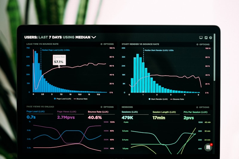
Mobile-friendly navigation menu on smartphone

4. Optimize Content for Mobile Reading

Mobile readers prefer concise content with clear headings, short paragraphs, and bullet points. Large blocks of text are hard to read on smartphones.

Solution: Break content into smaller sections with H2 and H3 headings. Use short sentences and plenty of white space.

πŸ‘‰ SEO content writing β†’

5. Use Mobile-Friendly Images & Videos

High‑resolution media can slow mobile pages and frustrate users. Optimizing images and videos is essential for mobile SEO.

Solution: Compress media files, use responsive image tags (srcset), and consider lazy loading. Embed videos that adapt to screen size.

6. Implement Structured Data (Schema)

Structured data helps Google understand your content and display rich snippets in search results. FAQ and Article schemas enhance mobile search visibility.

Solution: Include JSON‑LD schema for blog posts and FAQs. For example, link to Common SEO Mistakes Made by Kenyan Websites with FAQ schema.

Structured data schema markup code on laptop

7. Prioritize Local SEO on Mobile

Kenyan users often search for nearby services. Mobile local SEO ensures your business appears in β€œnear me” searches and Google Maps results.

Solution: Optimize your Google Business Profile, include NAP consistently, and target local long-tail keywords like β€œmobile SEO services Nairobi.”

πŸ‘‰ Local SEO Kenya β†’

8. Test Mobile Usability Regularly

Even after optimization, issues may arise due to updates, plugins, or new content. Regular testing ensures a seamless mobile experience.

Solution: Use Google Mobile‑Friendly Test, PageSpeed Insights, and real‑device testing. Track user behavior through Analytics to identify problem areas.

9. Avoid Intrusive Popups

Popups that cover content are penalized by Google’s mobile algorithm and frustrate users.

Solution: Use exit‑intent popups or banners that do not obstruct content. Focus on mobile‑optimized CTAs.

Mobile popup best practices example

10. Monitor & Adjust Mobile SEO Strategy

Mobile SEO is ongoing. Track rankings, traffic, and engagement to optimize performance continually.

Solution: Use Google Analytics and Search Console. Compare desktop vs. mobile performance and adjust site speed, design, and content as needed.

πŸ‘‰ SEO analytics & reporting β†’

🧠 Before & After – Mobile SEO Fix

❌ BEFORE (Poor Mobile SEO)

  • 6s load time
  • Not responsive
  • Tiny unclickable buttons
  • Poor Core Web Vitals
  • High bounce rate (80%)

βœ… AFTER (Optimized)

  • 1.9s load time
  • Fully responsive
  • 48px touch-friendly buttons
  • Core Web Vitals passed
  • Bounce rate reduced to 45%

πŸ“Š Case Study: Nairobi E‑commerce Store – Mobile Traffic Increased 180%

Client: Online store in Nairobi

Problems found: 6s mobile load time, non‑responsive design, missing alt text, poor Core Web Vitals

Solutions implemented: Responsive redesign, image compression, lazy loading, caching, font optimization

Results within 8 weeks:

  • πŸ“ˆ Mobile organic traffic +180%
  • ⚑ Page speed improved from 6s to 1.9s
  • πŸ“ž Mobile conversions increased by 120%
  • πŸ† Bounce rate dropped from 80% to 45%

πŸ‘‰ Fix your mobile issues β†’

⭐ What Kenyan Business Owners Say

β€œOur mobile site was painfully slow. After DK Digital optimized speed and responsiveness, our mobile traffic doubled and sales increased significantly.” – James K., Nairobi
β€œThe Core Web Vitals fixes alone improved our rankings dramatically. Highly recommend their mobile SEO expertise.” – Linda A., Mombasa

πŸ’° Real Value of Mobile SEO in Kenya

Mobile SEO audits start at $199. Monthly mobile optimization packages start at $299/month. The ROI? A 2x increase in mobile traffic can double your revenue.

πŸ‘‰ Today: Get a FREE $100 Mobile SEO Audit (no obligation)

πŸš€ Claim Your Free Audit β†’

πŸ“ž Get a Free Mobile SEO Audit – Diagnose Speed & Usability Issues

Limited spots this week. We’ll analyze your mobile speed, Core Web Vitals, and usability – then deliver a custom fix roadmap.

Form not working? WhatsApp us directly at 0710346425 or email davidochieng99@gmail.com.

βœ” No commitment β€’ βœ” Free consultation β€’ βœ” Actionable fix list

πŸ“± Ready to Capture Mobile Traffic & Rank Higher?

Most Kenyan websites have critical mobile issues. Get a free audit and start fixing them today.

Get Your Free Mobile SEO Audit β†’ Chat on WhatsApp

Limited spots – only 5 free audits per week.

❓ Frequently Asked Questions – Mobile SEO in Kenya

Why is mobile SEO important for Kenyan websites?
Most Kenyan users access websites through mobile devices, making mobile optimization crucial for user experience and Google rankings. Google uses mobile‑first indexing – your mobile version determines rankings.
What are the key mobile SEO practices?
Responsive design, fast page speed (Core Web Vitals), optimized images, structured data, and mobile‑friendly navigation are essential for mobile SEO.
How can I test if my Kenyan website is mobile-friendly?
Use Google’s Mobile‑Friendly Test or PageSpeed Insights to evaluate mobile usability, load speed, and responsiveness.
How much does mobile SEO optimization cost in Kenya?
Mobile SEO audits start at $199. Monthly optimization packages start at $299/month. Free $100 audit available.
What are Core Web Vitals and why do they matter?
Core Web Vitals are Google’s metrics for loading speed (LCP), interactivity (FID), and visual stability (CLS). Poor scores hurt mobile rankings.
How long does mobile SEO take to show results?
Speed and usability fixes can show impact in 2‑4 weeks. Significant ranking improvements typically take 2‑3 months.

πŸ“š Next Guides You Should Read

Need mobile SEO help? Chat now